Standard, Population & Customised fetal size charts 1 – newborns
Universal fetal growth standard charts, derived from healthy normal mothers having healthy normal pregnancies, have not been widely adopted, at least not in the UK. Instead local population charts, and charts “customised” for various parental factors, keep popping up. Most experts think both the latter are a bad idea; click here for an up-to-date technical description of the reasons. This series will explain why in lay language. The debate can get emotive, so before I tackle fetal charts, let’s look outside pregnancy. After birth no-one customises on anything but the baby’s sex. Or do they?
Newborn & Child Growth Charts
In 1997 the World Health Organisation (click here) developed standard charts for newborns and children. They based them on the healthy breast-fed babies of healthy well-nourished mothers. They were uncontroversial, and are now used almost everywhere, including the UK. Of course in some countries with high rates of malnutrition, more than half of babies fall below the 50th centile, but no-one argues the charts are wrong. They carry on using them and concentrate on improving nutrition. In other countries with high rates of bottle feeding or other types of over-nutrition, local babies appear bigger than expected by the charts. But again no-one argues the charts are wrong; the abnormally big babies grow into obese adults. We concentrate on encouraging breast feeding and healthy diets. With one exception.
United States babies are also significantly larger than those on whom the WHO charts were based. The reason is also that many are bottle-fed or over-fed in other ways. We can see the consequences. But some US doctors argued for local US population charts prepared by the US Centre for Disease Control (CDC). Such population or “reference” charts are a first step towards customisation. In this case a boy’s chart is “customised” for an “American boy”. Take a look at the two charts below. Left – WHO “standard” chart. Right – US population “reference” chart. Ignore the CDC logo on both.

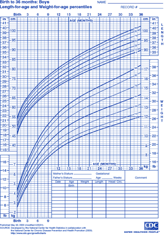
The WHO 50th centile for 18-month-old boys is 10.9 kg, and the US 50th centile 11.8 kg. Nearly a ten percent, 1 kg, difference – in means! Those doctors who use the US population charts are telling the parents of overweight boys that their son is “normal weight for America”, and missing an opportunity to improve his diet and prevent him growing into an obese adult.
If you’re an obstetrician or midwife, and the above seems obvious and sensible, there’s no need to read on. Make sure your hospital scan department is using a universal growth standard chart (WHO or Intergrowth-21) and get on with more important things. But if you’ve been told that customised charts are a good idea, and are unconvinced by the above, the next few posts are for you.
Tomorrow some technical background (click here).
Jim Thornton

Hi Jim Nice thoughts. Your click here for technical issues is not coloured and you can not get access to it BW Jeremy
Sent from my iPhone
>
It’ll be live tomorrow Jeremy. I’ve got a lot to say on this topic (about 18 posts I reckon) & I’m aiming to post one a day. 🙂