Standard, Population & Customised fetal growth charts 14 – GROW
Customised charts
The Perinatal Institute (click here) is a leading UK advocate of customisation. It markets Gestation Related Optimal Weight (GROW) charts, customised on the mother’s height, weight, ethnicity and parity (1). Two charts are typically combined into one physical chart which can be printed out and filed in the woman’s record. The left hand scale shows fundal height in cm and the right hand estimated fetal weight (EFW) calculated from a combination of biparietal diameter, head circumference, abdominal circumference and femur length, using Hadlock’s formula, in grams. Staff are encouraged to plot fundal height using an X symbol and EFW using a O. Examples below.


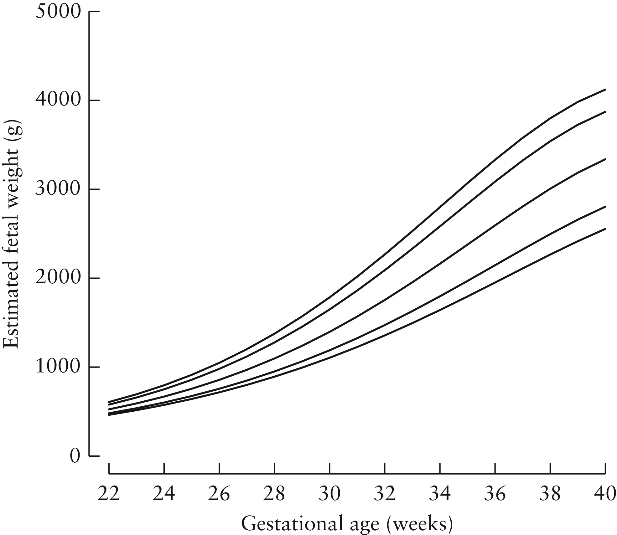
The left hand chart is for a normal weight and height British European woman (2), and the right for an underweight Indian woman. Both customised charts include an estimate called the Term Optimal Weight (TOW). For the British European baby this is 3,429g and for the Indian one 3,042g. The difference matters. Imagine that the EFW was 2,000g at 39 weeks. The British European mother would be told that her baby was growth restricted and likely advised to have labour induced, but the Indian woman would be told that the weight was “normal for her ethnicity, height and weight” and probably allowed to let the pregnancy continue.
Their customisation principles are detailed on the website (click here) but the exact formulae in use at any one time are a commercial secret. They are regularly updated on the basis of data sent back to the Institute by their customers. This is a potential weakness since, although GROW customers have been trained in both fundal height and scan measurements, it is unlikely that the biases which inevitably affect revealed human measures in practice will have all been removed (click here).
The underlying justification for the choice of features on which GROW charts are customised is also weak. Self-reported ethnicity has both theoretical (click here) and practical (click here) problems. Maternal height (click here), weight (click here) or parity (click here) are problematic because underweight, shorter, and first time mothers all have both smaller babies and higher perinatal mortality. Customisation on those features thus risks normalising pathology. It would only be justified if we could be sure that the strength of relation between each feature and adverse outcomes was weaker than that between birth weight and adverse outcomes (click here). There are no such data. Even those WHO standard chart authors who advocate customisation in theory, have not even attempted to provide such data (click here). Customisation by fetal gender makes theoretical sense (click here) but GROW charts do not at present offer this.
Finally GROW only provides customised charts for fetal weight, not for head or abdominal size, or fetal length separately. This condemns obstetricians using GROW charts to either ignore these component measures or to interpret them on a different, non-customised chart (click here).
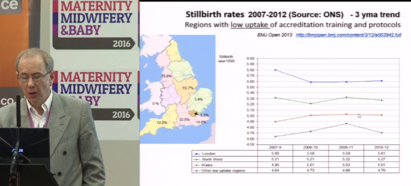
The Institute’s director, Professor Jason Gardosi, claims that GROW chart introduction was associated with a reduction in stillbirth and that the reduction was greater in English regions with higher uptake of GROW charts. Both claims are doubtful. The following are screen grabs taken from a lecture he regularly gives, available on the Institute’s website (click here). The data are those in his BMJ Open paper (click here). The graph scales appear to have been selected to emphasise a point.


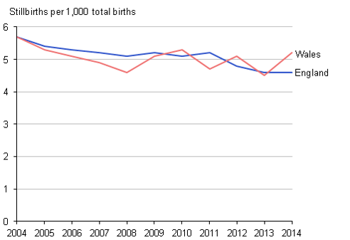
Note how the vertical scale differs between the left and middle slide. The right hand slide (3) is fairer. Stillbirths were falling long before GROW charts were introduced and if anything the trend has levelled off.
The choice of time periods and regions to report may also be selective. See left and middle figures below.


The right hand slide shows the same data for the whole of the UK (3). The rate of fall slowed slightly in England and Wales where GROW software was most widely used, and was steepest in Scotland where GROW software was not in use.
The reasons for this general trend are well understood. Falls in smoking, increased diagnosis and termination for lethal fetal abnormalities, and increased inductions near term, all three of which reduce stillbirths. Given the undoubted benefits of the rest of The Perinatal Institute’s training in encouraging staff to measure fundal height correctly and to act on the results, this hardly suggests that customisation is beneficial.
Next, other empirical comparisons (click here)
Jim Thornton
Footnotes:
- The Perinatal Institute also provides training in various aspects of maternity care. This latter work is generally agreed to be excellent.
- British European is not currently one of the official UK ethnicity groups. Presumably the Perinatal Institute authors mean White British.
- I thank Professor Gordon Smith for the national stillbirth data.
Standard, Population & Customised fetal size charts 12 – WHO
World Health Organisation (WHO) fetal growth charts
Like Intergrowth-21 these are standard charts. They were published in 2017 (click here).
Participants came from ten urban centres, Rosario Argentina, Campinas Brazil, Kinshasa Congo, Copenhagen Denmark, Assiut Egypt, Paris France, Hamburg-Eppendorf Germany, New Delhi India, Bergen Norway and Khon Kaen Thailand. They were all living below 1,500m, aged 18-40, with BMI 18–30kg/m2, a singleton pregnancy, gestational age at entry between 8-13 weeks, no chronic health problems or long-term medication, no environmental or economic constraints likely to impede fetal growth, non-smokers, with no history of recurrent miscarriages, preterm delivery or birth of a baby <2,500g. The ultrasonographer training and scan techniques were carefully standardised and quality controlled.
There were three major differences with Intergrowth-21. The WHO sample was smaller, only 1,387, compared with Intergrowth’s 4,321, which will have reduced the precision, especially of the outer centiles. WHO revealed the scan measures on the screen as the ultrasonographer placed the calipers, which could have biased the results (click here). Finally WHO used Hadlock’s formulae to estimate fetal weight, which may have affected those results, albeit in uncertain ways (click here).
The authors noted fetal sex differences in size, which others have also observed (click here). Otherwise, with the exception of estimated fetal weight, see below, the final charts were close to those of Intergrowth-21. Here are the two charts for head circumference. Note they are not exactly comparable since Intergrowth-21 left, gives 3rd, 10th, 50th, 90th and 97th centiles. WHO right, gives the 1st, 5th, 10th, 50th, 90th, 95th, and 99th.


And here they are for abdominal circumference
The WHO researchers also published separate estimated fetal weight charts by country, and noted, in alleged contrast to Intergrowth-21, that some country charts differed significantly from the pooled chart. The explanation may partly be that the two groups of researchers used different statistical techniques to calculate the smoothed centile curves*. But there is no dispute that some geographical size differences remain.
The most likely explanation is that neither group managed to completely exclude malnourished women, or those with other environmental constraints on growth, from the populations they studied. Both made a valiant attempt to produce healthy standard charts, but are unlikely to be the last word on the topic (click here). Observing small differences, even in apparently healthy pregnancies, between some rich and poor countries does not prove the existence of an innate racial, ethnic or national difference on which we should customise.
Nevertheless seven of the WHO study’s twenty two authors see things differently and have gone on to strenuously argue (click here) that their data support the use of different charts for different populations. They provide no detailed prescription for how this should be done.
They wisely don’t support customisation by ethnicity since “Ethnicity, and particularly self-reported ethnicity, is not a straight-forward characteristic of a person or population”. Nor customisation by country since this is both impossible for the 185 countries for which WHO produced no chart, and makes even less sense than customisation by ethnicity!
The WHO data showed that older women had bigger babies (2–3% per 10 years), that multiparity increased fetal weight by 1–3%, and that maternal height increased it by 1–2% per 10 cm. All three effects more marked on smaller fetuses. Maternal weight also increased fetal weight by 1–1.5% per 10 kg, but that effect was greatest among larger fetuses. Recognising that none of these effects were large and exerted unequally among different weight centiles, the WHO authors accepted that any customization for individual use would be complicated, although “statistical development, growing computer power, and more data accrual should handle it”.
Perhaps so. But customisation requires more than just showing that size differs according to a particular feature. To make customisation useful we need to also show that the strength of the relationship between size and pathology is stronger than that between the feature and pathology. There is a strong relation between smoking and stillbirth (click here) but no-one wants to customise on that! The WHO authors did not even attempt to measure the strength of the relation between age, parity, height or weight to pathology, and compare each with that of size to pathology.
It is difficult to know exactly what in practice the seven WHO authors recommend, and tempting to conclude that they had some other dispute with Intergrowth-21 (see next post).
WHO and Intergrowth-21 are the best two fetal growth standard charts. Since Intergrowth-21 is based on a larger sample, and used better methods for avoiding bias, their charts are marginally to be preferred. It’s a bonus that they are also user-friendly and have been integrated into most of the leading scan software packages.
Next the WHO-Intergrowth plagiarism dispute (click here).
Jim Thornton
* For those who are interested, the Intergrowth-21 authors tested whether the distribution of values for each gestational age was normally distributed. It was, so they created their standards using a statistical technique, fractional polynomials, that required such a distribution. The WHO researchers in contrast used a technique, quantile regression, which required no assumptions about the data distribution.
Standard, Population & Customised fetal size charts 11 – Intergrowth 21
Standard charts
In 2008 the Intergrowth-21 group, funded by Bill Gates, produced a series of growth standard charts for fetuses. Click here for their website, here for the main report and here for their estimated fetal weight standards, which were published separately. According to some historians Intergrowth-21 was originally a spin off from the World Health Organisation (WHO) fetal growth standard group. However the main reports from Intergrowth-21 preceded publication of those from WHO.
Intergrowth-21 collected scan measures from 4,600 healthy fetuses and healthy mothers in eight geographically distinct urban areas, Pelotas Brazil, Turin Italy, Muscat Oman, Oxford UK,
Seattle USA, Shunyi County Beijing China; Central Nagpur India, and Parklands Nairobi Kenya, where environmental, nutritional and social constraints on fetal growth were judged to be minimal. It was called the Fetal Growth Longitudinal Study (FGLS). They chose cities located below 1600 metres, with low levels of pollution. The women had no clinically relevant medical problems, started antenatal care before 14 weeks, had a height ≥153 cm, a body-mass index (BMI) between 18 and 30 kg/m², a haemoglobin concentration ≥110 g/L, and were not on any special diet. This resulted in a group of educated, affluent, clinically-healthy women, with adequate nutritional status, who by definition were at low risk of fetal growth restriction and preterm birth. The Intergrowth-21 group used all the latest scan methods as well as modern techniques to avoid bias (click here).
The authors found little variation by ethnicity. Specifically there were no statistically significant differences between each geographical area and the pooled data from the other seven. The charts also aligned closely with newborn charts from similar healthy populations.
This lack of important size difference between healthy fetuses from different ethnic groups implies that the differences we see every day between such groups are largely a result of environmental and nutritional factors. Once these are removed the differences disappear. It is strong evidence against customisation by ethnicity.
But it is also the reason why some enthusiasts for customisation push back so strongly against it. They dispute the statistical methods, or point to other standard charts, notably those from WHO which we will discuss tomorrow, showing small differences between geographic groups, as evidence for customisation. But the converse argument does not apply. Finding ethnic differences even in standard charts, is not strong evidence for customisation. There are small differences, e.g between Seattle and Shunyi County, in Intergrowth-21, and between countries in WHO, but the most likely explanation is that neither group of researchers succeeded completely in removing all study participants who had environmental constraints acting on their pregnancy.
The Intergrowth-21 authors concluded that their charts are the single best growth standard chart for use worldwide, and I agree. We use them in Nottingham.
Next (click here) the WHO standard charts.
Jim Thornton
Another technical digression
There are no customised charts for direct fetal scan measures. They only exist for fetal weight and fundal height. This suits parents and non-experts who, unfamiliar with fetal biometry, may prefer weight to say, the abdominal circumference centile. But it’s not straightforward for the obstetrician. Fetal weight is tricky to estimate, tricky to chart and tricky to interpret.
Once the baby is born we can weigh it. But until then we have to use formulae based on a combination of head, abdomen and femur measurements. The most popular were developed by Frank Hadlock in the 1980s, in Texas. He studied 276 fetuses each scanned within a week of birth (click here), which is rather few, especially as nearly half were less than 24 weeks. Nor would the details of his scan methods pass muster today (click here), although that is hardly his fault. Scan technology, and ways to reduce bias, have developed considerably since.
Turning weights, whether real or estimated, into a chart is also more complicated than just the choice of “population” or “standard” we discussed a few posts ago (click here). Charts based on babies actually born preterm, systematically underestimate centiles because babies born pre-term tend to be growth restricted. Normal weight babies at say 30 weeks, mostly don’t deliver at 30 weeks, so they can only be measured not weighed.
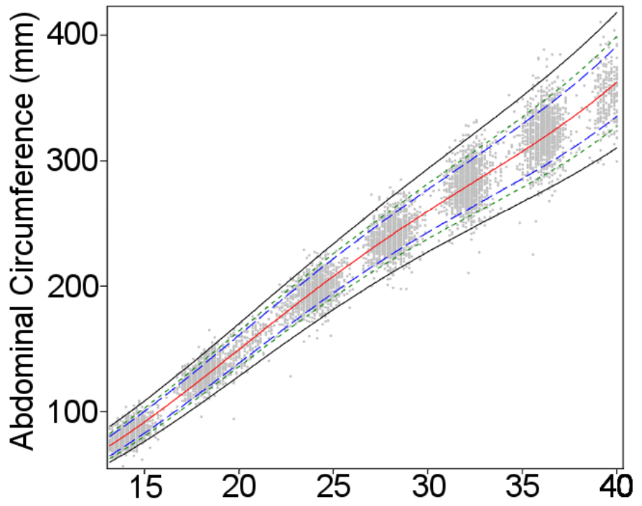
The figure below (taken from Stirnemann click here) shows the problem. The dotted lines are 3rd, 50th and 97th weight centiles based on babies actually born. The solid lines the same for all babies, including those who don’t deliver preterm. Not much difference at term (black square), but at 28 weeks a baby on the 50th centile of babies born at that gestation (black circle), lies below the 3rd for the whole population.

So how did Stirnemann and his Intergrowth-21 colleagues develop their chart? Their trick was this.
First they scanned a lot of fetuses, including those from unhealthy pregnancies, but using the up-to-date methods for avoiding bias. Some came from the Fetal Growth Longitudinal Study (FGLS) which we will describe later. The rest from an unselected cohort of women including smokers, and those with problem pregnancies, the INTERBIO‐21st Fetal Study. They then measured the birth weights of those babies who happened to be born within a short interval of the scan. There were 2,404 of these. Again they took special care with the birth weight measurements, drying the baby carefully, cutting the cord to a standard length, using a standard cord clamp and a trained person to work specially calibrated random-zero electronic scales to avoid digit preference. The babies born preterm included many that were not healthy, but that didn’t matter at this stage. They simply used the measurements, with a small correction for the interval between the measurement and the actual birth, to create new formulae for estimating weight from head, abdomen and femur measures. i.e. the same as Hadlock, but with a larger sample, and modern scanning, weighing and bias reducing techniques.
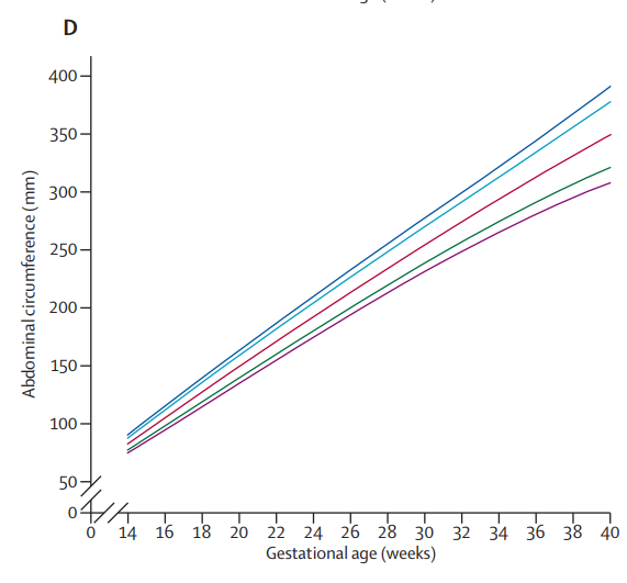
The second stage of the procedure was to apply those formulae to the scan measures from healthy babies in the Fetal Growth Longitudinal Study, i.e. the main Intergrowth-21 population. Those are the weights and centiles that comprise the Intergrowth-21 fetal weight standard charts. Here’s the final result. Left the chart in Stirnemann’s paper and right the nicely printed version for regular use.

Frank Hadlock knew, and the creators of customised charts like GROW also know, that fetuses born preterm are systematically lighter than those destined to be born at term. Both made similar adjustments (click here for Hadlock’s, and here for GROW’s methods). I’m not suggesting that either confuse the weights of babies actually born preterm with those that go on the deliver at term. However the GROW customised charts from the Perinatal Institute are based on weights estimated using Hadlock’s formulae, which themselves were created from a relatively small number of women in Texas in the 1980s, using the methods and scan machines available then.
Another issue with using ultrasound-based weight estimates to manage pregnancy is that they may not be the best predictors of babies who are likely to die, be brain damaged or unable to withstand the stress of labour. Expert interpretation of the individual measures from which the weight was estimated is often better. For example, if a fetus with a small abdominal circumference has relatively long legs or a big head, it will be heavier, but more malnourished.
Finally, since customised direct fetal measure charts don’t exist, obstetricians who use customised weight charts have to either ignore the individual components on which the weight was estimated, or use a non-customised chart to interpret those. At the very least a source of avoidable confusion.
Antenatal assessment of fetal compromise is complicated. That’s why we have fetal medicine specialists. Combining multiple size measures into a single estimate of weight may please parents, but is a potentially misleading simplification.
This is the last technical digression. Now we are ready to look in detail at the main modern charts, Intergrowth-21, WHO and the main customised chart, GROW. Tomorrow Intergrowth-21 (click here)
Jim Thornton
Standard, Population & Customised fetal size charts 9 – gender and parity
Customisation by fetal gender
After birth, male and female babies differ in size, and gender specific charts are widely used. This is reasonable since gender specific differences in mortality or morbidity are unrelated to fetal size. On the contrary, male babies tend to be larger but have higher rates of mortality and morbidity, so gender specific charts are likely to better identify pathology.
There are also fetal gender differences in size (click here), so in theory gender specific charts might also be appropriate in utero. However, in practice the gender differences are rather small, and because of practical difficulties – the ultrasonographer might be uncertain, or the parents might not want to know – gender specific fetal charts tend to be limited to specialist uses (click here).
Customisation by maternal parity
Birth weight and size increase with parity, at least over the first few pregnancies, but this is not independent of pathology. First babies are smaller than subsequent ones but have a higher mortality, partly because pre-eclampsia is common in first pregnancies, and partly because first labours tend to be longer. To a lesser degree, at least in the developed world, some of the increase in birth weight with increasing parity is related to increasing maternal weight. Again this is not benign. For these reasons customisation on maternal parity is unwise.
Tomorrow another technical digression. This time on estimated fetal weight (click here).
Jim Thornton
Standard, Population & Customised fetal size charts 8 – height
Customisation on maternal height
If there is any justification for customising fetal size charts, this is likely to be it. Height is objective, easy to measure, does not vary by gestational age, and is not influenced much by current nutrition, smoking or drug abuse. And taller mothers do tend to have larger babies.
If maternal height was largely due to benign genetic variation, with healthy tall mothers having larger healthy babies, and healthy shorter mothers having healthy smaller ones – remember the Shire horses and Shetland ponies- it would improve detection of pathology. But it is not.
Height is also closely related to parental and early life nutrition, and to health in adult life. Over the last 100 hundred years average heights have increased much faster than they plausibly could have by natural selection (review here). The cause is almost all better nutrition, reduced infections and other environmental improvements. Over this period perinatal mortality has fallen steeply. Even within modern populations short maternal height is clearly associated with stillbirth (table 1 here).
We don’t need to assume that short height causes stillbirths to make customisation inappropriate. If height is associated with some third factor which causes the adverse outcomes it would still be an inappropriate measure on which to customise.
Next gender and parity (click here)
Jim Thornton
Standard, Population & Customised fetal size charts 7 – maternal weight
Underweight women have smaller babies and overweight ones larger. Compared with ethnicity (click here and here) customising by weight should be straightforward. But it’s still unlikely to improve detection of adverse outcomes.
Outside a relatively narrow band, BMI 18-25, weight variation is not healthy. Undernourished women, smokers and users of other substances, have smaller babies, but also more dead and brain damaged ones. Those who are underweight because their mothers had been undernourished during their own pregnancy, probably also have higher rates of adverse outcomes.
Similarly the overweight population includes women who are over eating, and women with diabetes or pre-diabetes, whose babies are large in an unhealthy way. They also have more stillbirths, birth injuries and other adverse outcomes.
This is why, at the extremes, customising on maternal weight is harmful. It leads us to tell an overweight diabetic mother with a BMI of 35 that her macrosomic baby was “normal for her weight”, or an underweight woman with a malabsorbtion syndrome, that her small baby was “normal for her”!
Customising on weight within the relatively narrow band of “healthy” weight variation might make sense, but in practice variation in fetal size within this normal band is small. Enthusiasts for customisation such as the Perinatal Institute (click here) recognise this and their GROW customisation software limits the adjustment on the basis of weight to the central BMI zone. However, presumably because they wish to “explain” more birth weight variation, they customise up to BMIs of 30, the borderline between “overweight” and “moderately obese”. This is not a healthy weight.
Next customisation by height (click here)
Jim Thornton
Standard, Population & Customised fetal size charts 6 – practical problems with race or ethnicity
Last Saturday (click here) I suggested that the relation between race or ethnicity and poor pregnancy outcomes made customisation of fetal size charts by either, a poor way to improve detection of adverse outcomes. This post considers more practical issues.
Classification of human beings by race, an inherent physical or biological quality attributable to some groups rather than others, arose as a scientific idea in the 17th century, reached its full flowering in the 19th, degenerated into a justification for mass murder in the mid twentieth century and is now completely discredited. Although the word “race” has a lay meaning, it no longer has a scientific one. Even if we wanted to, we couldn’t customise charts by race.
Classification by ethnic group, shared ancestry, language, homeland and other cultural features, is possible but also problematic. Definitions of what constitutes an ethnic group vary over time and by who is doing the classification, and the history of claiming ethnic differences in other areas such as IQ, criminality, sporting prowess etc. have all been based on poor science, often driven by racist ideas.
Ethnicity is also problematic because so many human beings are of mixed ethnicity. This paper (click here) nicely shows the problems. This not only makes it difficult for the clinician faced with a mixed ethnicity parent, to know which chart to use. It also causes problems for scientists drawing up ethnically-based customised charts. How can they ensure that the people on whom their charts were derived, were of “pure” ethnicity?
In practice most ethnically customised charts are based on “self-reported ethnicity”; typically a “tick box” completed by a clerk when the patient registers. No-one knows whether the clerk based their decision on self-report, skin colour, facial features or something else.
To summarise ethnicity is poorly defined, and many of our patients are of mixed ethnicity, so even if ethnicity wasn’t also related to poor outcomes, which it is, it would be an unsuitable factor on which to either create customised charts or to decide which charts to use.
Next weight (click here)
Jim Thornton
Standard, Population & Customised fetal size charts 5 – race ethnicity
At first sight customisation by maternal (or paternal) race or ethnic group appears sensible. Han Chinese women, for example, tend to be smaller than say Swedish women, and have smaller babies. Surely we should plot their baby’s growth on different charts.
But how can we be sure that the ethnic “differences” we observe are not on, or correlated with, the pathway to the pathology we are trying to identify?
Consider the two ethnic groups above, who appear to differ in size, and have had relatively little historical intermingling, Northern Europeans, and the Han Chinese. Northern European women and their babies are taller, and larger than Han Chinese. But perinatal mortality is also higher in the Han Chinese.
Both differences are probably at least partly caused by under nutrition among the Han Chinese ancestors who would have lived through two of the worst famines in recent human history, Mao Tse Tung’s Great Leap Forward, and Cultural Revolution. Both will certainly be affected by present day differences in nutrition, and smoking and drinking habits. If so, the observation that more than n% of Chinese babies fall below the nth centile of Western European charts, is a sign that such babies are genuinely failing to reach their full growth potential, rather than that the charts are wrong.
It doesn’t matter if race or ethnicity causes the adverse pregnancy outcomes, or is just correlated, the fact that there is a correlation should make us think twice about customising on either. Although even a strong correlation in itself doesn’t prove it wrong. If race was less strongly correlated with adverse outcomes than size, customisation on race, at least in theory, might still work.
Tomorrow (click here) we’ll see some practical reasons why successful customisatiom by race or ethnicity is in reality a hopeless quest.
Jim Thornton
Standard, Population & Customised fetal size charts 4 – principles
Previous posts (click here and here) set the scene; how to get accurate scan measures, and the difference between reference and standard charts. Now the main event.
Customisation
This means creating a special chart based on one or more “custom” features of the individual being measured. Vets do it all the time – they couldn’t use the same chart for a Shire horse and a Shetland pony! Customisation makes sense for equines because even healthy foals differ in size.
But what about human smokers and non-smokers? Their fetuses differ in size too, but customised charts for smokers would be bonkers. What’s the difference?
The principle is as follows. Charts are used to predict pathology, death, brain damage etc.
For factors unrelated to the pathology sought, customisation is appropriate.
A Shetland pony is not a malnourished Shire horse, so it is good practice to have different charts to detect both malnourished Shire Horses and malnourished Shetland ponies.
But for factors lying on the pathway which leads to pathology (e.g. smoking is on the pathway to stillbirth) customisation is inappropriate.
Note the choice of words, “lying on the pathway” rather than “causing”. For this purpose, correlation is equivalent to causation; customisation on a measure which is simply correlated with pathology is also inappropriate. Consider social class. Babies of mothers in lower social classes tend to be smaller, but it is unlikely that social class affects size directly. More likely the effect is mediated via differences in diet, smoking or some other behaviour. But it would still be inappropriate to produce separate customised charts for different social classes.
Note two. Strictly the principle relates to the relative strength of the size/factor relationship to the outcome we wish to predict. If the relationship between smoking and stillbirth is stronger than that between size and stillbirth, customisation on smoking would have the net effect of reducing the identification of babies who were destined to die. If smoking was less strongly related there might theoretically be a way to customise charts by smoking status which improved detection of stillbirth. The latter might apply to maternal height (see later post).
In the next few posts we’ll look at some real factors for which doctors have suggested customisation, and see if they make sense. First race and ethnicity (click here).
Jim Thornton
