Standard, Population & Customised fetal size charts 3 – Population/reference or healthy/standard?
Some of the confusion about fetal charts arises from the language used to describe the various non-customised sorts. It is confusing. “Population” and “reference” are different ways to describe one type of chart. “Healthy” or “standard” different names for the other type.
Population/reference charts
Older fetal growth charts were based on populations of more or less randomly selected pregnant women, including those whose pregnancy had, or was destined to have, problems of one sort or another. The idea was that the charts would “do what it said on the tin”; ten percent of fetuses below the 10th centile, ten percent above the 90th and so on.
But populations vary, so doctors often noticed that the charts were “wrong”, and derived a new set for their local population. Many hundreds of different charts were developed. In the UK the most popular was the Chitty chart* (click here), developed from measurements made on 663 consecutive women booking at Kings College Hospital in South London in the early 1990s. Such charts are also called reference charts because they “refer” to a particular population. However, I will use the term “population chart”.
As an aside, local population charts, for example for Pacific islanders, South Indian women, or for that matter “women booking in Kings College Hospital in South London in the early 1990s”, are a type of customised chart. So long as they are used for the population on which they were developed, they are “customised” for that particular population. But true customisation in the modern sense, which we will discuss tomorrow, is more sophisticated.
Healthy/standard charts
These are derived from healthy well-nourished populations excluding, as far as possible, problem pregnancies. The idea is that they provide a “standard” measure of growth in the absence of disease or nutritional constraints. I will use the term “standard” in what follows.
One of the controversies in creating standard charts is to decide what constitutes a healthy population. We can all agree that smokers, and women with raised blood pressure or anaemia should be excluded, but what about short women? Perhaps they are short because of malnutrition early in life. What about underweight, or overweight women? The details matter but the principle is simple. We want to measure fetal growth against other healthy pregnancies.
In theory any difference between standard charts and real world populations reflects the amount of disease and abnormal nutrition in the real world. The fact that in the UK for example more than ten percent of the population lies below the 10th centile reflects the UK’s many smokers, whose babies are abnormally small. The fact that more than ten percent lie over the 90th centile reflects our many overweight or diabetic women. The discordance is a “feature not a bug!” Intergrowth-21 (click here) and WHO (click here) are standard charts.
Tomorrow customisation (click here).
Jim Thornton
* The eagle eyed will notice that Altman and Chitty were attempting to create a “standard” chart, and indeed they excluded some unhealthy pregnancies such as those with hypertension and diabetes.
Yesterday, in my first fetal size chart post (click here), I teased those doctors who customise children’s growth charts on the basis of US citizenship! I will be more serious as I consider fetal growth charts, but first let’s get some technical issues out of the way. We can’t weigh, or measure babies directly in-utero. We have to scan them. And we have to do the scan right.
- How to do the scans
As image quality improved, techniques changed. For example measuring the bi-parietal diameter (width) of the head from the proximal surface of the near skull bone to the proximal surface of the far one, used to be the standard technique. It always underestimated the actual measure, but was necessary because the distal surface of the far bone was indistinct. As image quality improved we can now easily see the outer surface of the distal skull bone, so we now measure “outer to outer”. But some old charts are based on the outdated method.
As outlining technology improved, calculating circumferences from two diameters measured at right angles was superseded by direct outline measures. But some old charts used the outdated method.
The need to create charts from correctly aligned scans showing the landmarks clearly, causes problems for population charts (more on these tomorrow) which unavoidably include overweight women whose scan views are often sub-optimal, but whose exclusion would distort the result. This is not a problem for the creators of standard charts because overweight women are excluded by definition.
2. How to make the actual measurements
If the ultrasonographer placing the measuring calipers can see the value he’s coming up with, he may unconsciously adjust the position to get a normal value, or report to the nearest whole or half millimetre. The way to avoid such bias and digit preference is to get someone who doesn’t know the woman to place the calipers, ovoids or other boundary markers on a stored image, and only reveal the measurement after placement is judged correct. It’s akin to using a random zero sphygmomanometer to measure blood pressure. Easy in principle, but expensive in practice. Few, if any, of the older charts even attempted it.
3. How many pregnancies to study.
Smoothed growth charts can be produced with small samples. They look good, but by definition include few measurements at the upper and lower centiles, making these outer lines imprecise. Charts based on large samples typically used routinely collected scan data and suffer from the measurement biases described above.
In practice only two modern charts have taken measures using the modern techniques, avoided bias, and had a sufficiently large sample size to estimate the outer centiles with any degree of precision. These are Intergrowth-21 (click here) and WHO (click here). We will return to them. Tomorrow some more technical stuff, the difference between reference or population charts and healthy or standard charts (click here).
Jim Thornton
Standard, Population & Customised fetal size charts 1 – newborns
Universal fetal growth standard charts, derived from healthy normal mothers having healthy normal pregnancies, have not been widely adopted, at least not in the UK. Instead local population charts, and charts “customised” for various parental factors, keep popping up. Most experts think both the latter are a bad idea; click here for an up-to-date technical description of the reasons. This series will explain why in lay language. The debate can get emotive, so before I tackle fetal charts, let’s look outside pregnancy. After birth no-one customises on anything but the baby’s sex. Or do they?
Newborn & Child Growth Charts
In 1997 the World Health Organisation (click here) developed standard charts for newborns and children. They based them on the healthy breast-fed babies of healthy well-nourished mothers. They were uncontroversial, and are now used almost everywhere, including the UK. Of course in some countries with high rates of malnutrition, more than half of babies fall below the 50th centile, but no-one argues the charts are wrong. They carry on using them and concentrate on improving nutrition. In other countries with high rates of bottle feeding or other types of over-nutrition, local babies appear bigger than expected by the charts. But again no-one argues the charts are wrong; the abnormally big babies grow into obese adults. We concentrate on encouraging breast feeding and healthy diets. With one exception.
United States babies are also significantly larger than those on whom the WHO charts were based. The reason is also that many are bottle-fed or over-fed in other ways. We can see the consequences. But some US doctors argued for local US population charts prepared by the US Centre for Disease Control (CDC). Such population or “reference” charts are a first step towards customisation. In this case a boy’s chart is “customised” for an “American boy”. Take a look at the two charts below. Left – WHO “standard” chart. Right – US population “reference” chart. Ignore the CDC logo on both.


The WHO 50th centile for 18-month-old boys is 10.9 kg, and the US 50th centile 11.8 kg. Nearly a ten percent, 1 kg, difference – in means! Those doctors who use the US population charts are telling the parents of overweight boys that their son is “normal weight for America”, and missing an opportunity to improve his diet and prevent him growing into an obese adult.
If you’re an obstetrician or midwife, and the above seems obvious and sensible, there’s no need to read on. Make sure your hospital scan department is using a universal growth standard chart (WHO or Intergrowth-21) and get on with more important things. But if you’ve been told that customised charts are a good idea, and are unconvinced by the above, the next few posts are for you.
Tomorrow some technical background (click here).
Jim Thornton
PHOENIX trial
Jim’s AsPredicted.org prediction
I like to predict what trials will show before I see the results. For my reasons click here.
The PHOENIX trial in this week’s Lancet (click here) tested the effect of immediate or delayed delivery for women with late preterm (34-37 weeks) pre-eclampsia. The researchers randomised 450 women (471 infants ) to planned delivery and 451 (475) to expectant management. The primary maternal outcome was a composite of death, morbidity or a systolic blood pressure of at least 160 mm Hg, and the primary fetal one a composite of death or neonatal unit admission. Nottingham was a participating centre but, apart from recruiting a few participants, I had no involvement.
I favoured delay. I thought planned delivery would reduce trivial adverse maternal events such as episodes of high blood pressure, but nothing that mattered, and that it would harm the baby. In May of this year, before I’d seen any results, I wrote on aspredicted.org (click here):
1. “The primary maternal outcome will favour immediate delivery. This will be statistically significant at the P<0.05 level. However after exclusion of the component “recorded systolic blood pressure ≥160 mmHg” from the primary maternal composite outcome the difference will no longer be nominally significant. I appreciate that this could be judged a data driven analysis, which is why I am registering my prediction here.”
2. “The primary short term baby outcome will favour expectant management. This will be statistically significant at the P<0.05 level.”
I was partially correct. The primary maternal outcome was reduced by early delivery, 289 (65%) v 338 (75%), relative risk 0·86, 95% CI 0·79–0·94; p=0·0005, and the primary fetal one increased, 196 (42%) v 159 (34%), RR 1·26, 1·08–1·47; p=0·0034). We can be confident that both effects are real. The trial was registered, the outcomes pre-defined, the sample size large, everyone was followed-up and the differences are unlikely to have occurred by chance.
However I was wrong to predict that the reduction in adverse maternal outcomes would disappear when raised BP was excluded. The top row of table 3 “maternal morbidity composite outcome” i.e. the composite without the raised BP component, was 68 (15%) v 90 (20%), RR 0.76; 0.59-0.98. The intervention really does reduce maternal morbidity. The authors argue that this strengthens the argument in favour of early delivery. But let’s look at what the morbidity consisted of. Supplemental appendix table 3. Not easy to access, so I’ve tidied it up below.
| Planned delivery (n=448) | Expectant management (n=451) | |
| Maternal death * | 0 (0%) | 1 (0%) |
| Eclampsia | 3 (1%) | 4 (1%) |
| Inotropic support | 0 (0%) | 1 (0%) |
| Infusion of 3rd parenteral antihypertensive drug | 2 (0%) | 0 (0%) |
| Myocardial ischaemia or infarction | 1 (0%) | 0 (0%) |
| SpO2 <90% | 2 (0%) | 3 (1%) |
| ≥50% FiO2 for >1 hr | 1 (0%) | 0 (0·0) |
| Intubation (other than for caesarean section) | 2 (0%) | 0 (0%) |
| Pulmonary oedema | 1 (0%) | 2 (0%) |
| Transfusion of any blood product | 20 (5%) | 23 (5%) |
| Platelet count <50×10⁹ per L, with no transfusion | 2 (0%) | 4 (1%) |
| Hepatic dysfunction | 44 (10%) | 63 (14%) |
| Acute renal insufficiency (creatinine >150 µmol/L) | 3 (1%) | 4 (1%) |
| Total women with morbidity** | 68 (15%) | 90 (20%) |
*The maternal death occurred unexpectedly, 5 days after delivery in a woman with medical co-morbidities, and was judged to be unrelated to the trial. **The numbers don’t add up because some women had multiple morbidities. No participants had a Glasgow coma score <13, stroke or reversible ischaemic neurological deficit, transient ischaemic attack, cortical blindness or retinal detachment, posterior reversible encephalopathy, hepatic haematoma or rupture, or acute renal failure (creatinine >200 µmol/L).
Pretty much all the difference was in worsening tests revealing liver or renal damage or low platelets. These are the tests which, alongside BP measurement and the fetal heart rate pattern, we use to monitor pre-eclampsia, and to judge the timing of delivery with expectant mangement. In well organised hospitals we should be able to prevent really serious adverse events such as stroke, heart attack, permanent organ damage or death. There were few such events and no obvious excess in the expectant management group.
Fetal outcomes are in table 4. No babies died and the only differences were in admission rates to various levels of neonatal unit admission. Here’s the relevant section.

There are more details in the supplementary appendix table 5. Serious adverse baby events were very rare and did not differ between groups.
Here’s my final take. The “harms” to the mother from waiting a bit were limited to abnormal blood or blood pressure tests to which the doctors responded correctly, and from which no long-term harm ensued. The “harms” to the baby from planned delivery were a bit of additional monitoring and oxygen therapy from which all the babies also emerged healthy. The authors conclude that “this trade-off should be discussed with women”. I agree, but I still favour delay.
I made a third prediction on Aspredicted.org:
3. The primary long term baby outcome (PARCA-R at 2 years) will not show any statistically significant difference (at the 5% level) between the groups. However I predict that the point estimates for those measures which had been predefined in the analysis plan e.g. mean or median scores, or rates of scores below various cut offs, will all favour expectant management.
Babies are resilient. They recover pretty well from all the stress that nature and doctors throw at them. But they prefer to not deliver preterm without a good reason. I’ll have to wait a little longer to find out if I’m right, and the PHOENIX trial is unlikely to be big enough to prove it, but I still think there will be subtle long-term harms from planned early delivery.
Jim Thornton
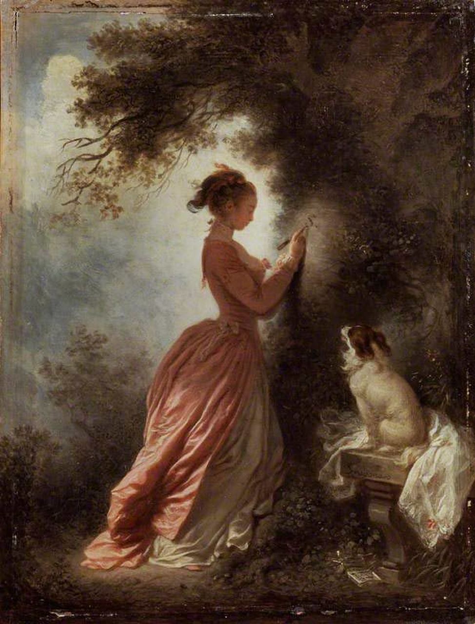
The Souvenir
By Jean-Honoré Fragonard
This low brow art lover prefers figurative to abstract, uplifting to depressing, sexy to dull, and can’t cope with too much at once. So for my first visit to the Wallace Collection (click here) I went straight to this. A young woman carves her lover’s initial into a tree. His letter lies on the ground and her faithful spaniel looks on. A New Yorker piece (click here) about the film maker Joanna Hogg and her latest film, The Souvenir, had piqued my interest. It’s tiny, much smaller than the more famous Swing in the adjacent room, but I wasn’t disappointed.
Jim Thornton
Field Flowers
By Louise Glück.
James Wood cited this poem in his review of This Life: Secular Faith and Spiritual Freedom by Martin Hägglund (New Yorker, May 20th, click here).
In that book Hägglund, a Swedish philosopher and literary theorist, suggests that even religious people don’t really want to live for eternity; limited time gives life value. He cites CS Lewis’s memoir A Grief Observed about his wife Joy Davidman. Her deathbed words, “I am at peace with God”, were directed to the chaplain, not Lewis, who wrote, “She smiled, but not at me. Then she turned towards the eternal fountain.” Hägglund argues – he’s also a deconstructionist – that Lewis knew, “There is no CS Lewis for Joy Davidman in heaven and no Joy Davidman for CS Lewis”. Our short lives are not just the only ones we will have, but the only ones we should want. He may be right.
Unfortunately, according to Wood’s review, Hägglund goes on to argue that this means we should follow all sorts of Marxist and anti-capitalist political nonsense.
Glück’s poem, narrated from the perspective of a flower, doesn’t make the same mistake.
Field Flowers
What are you saying? That you want
eternal life? Are your thoughts really
as compelling as all that? Certainly
you don’t look at us, don’t listen to us,
on your skin
stain of sun, dust
of yellow buttercups: I’m talking
to you, you staring through
bars of high grass shaking
your little rattle – O
the soul! The soul! Is it enough
only to look inward? Contempt
for humanity is one thing, but why
disdain the expansive
field, your gaze rising over the clear heads
of the wild buttercups into what? Your poor
idea of heaven: absence
of change. Better than earth? How
would you know, who are neither
here nor there, standing in our midst?
Louise Glück.
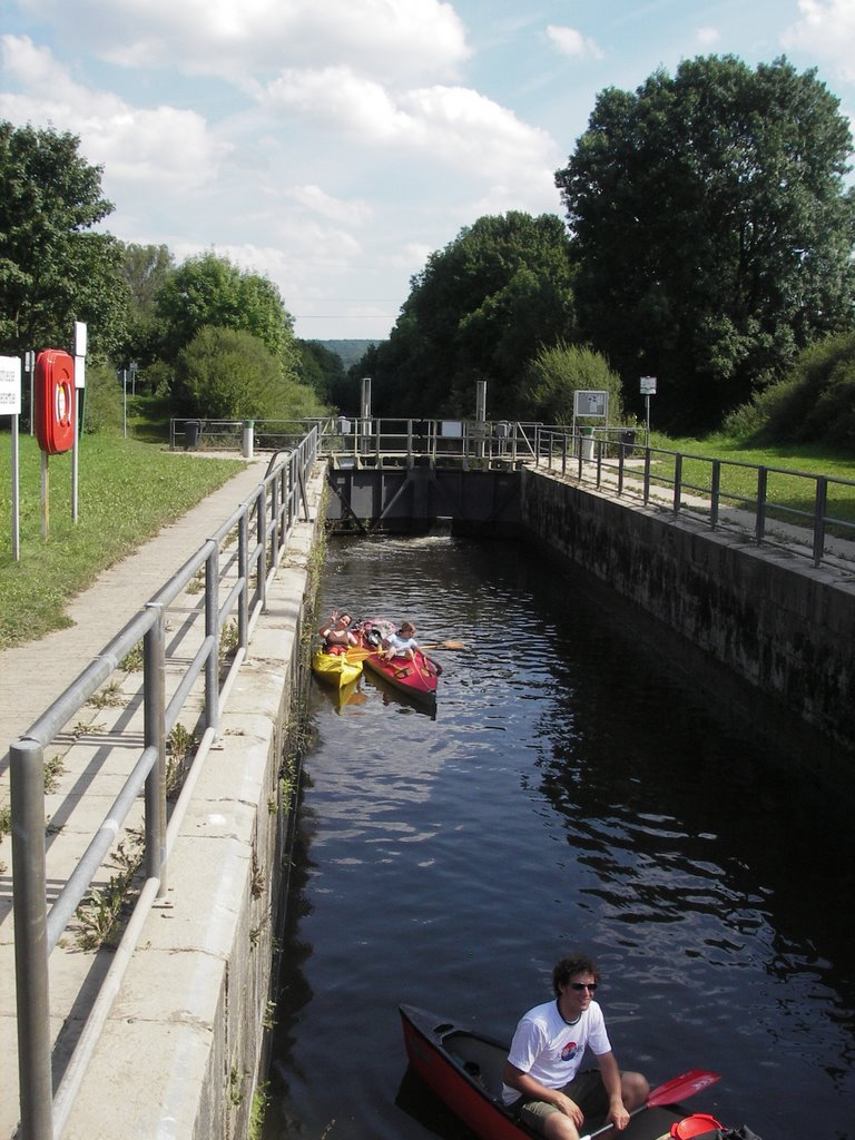
Lahn canoeing – 1
Canoeing beside the Camino de Santiago
Wetzlar to Limburg (Click here for Limburg to Lahnstein)
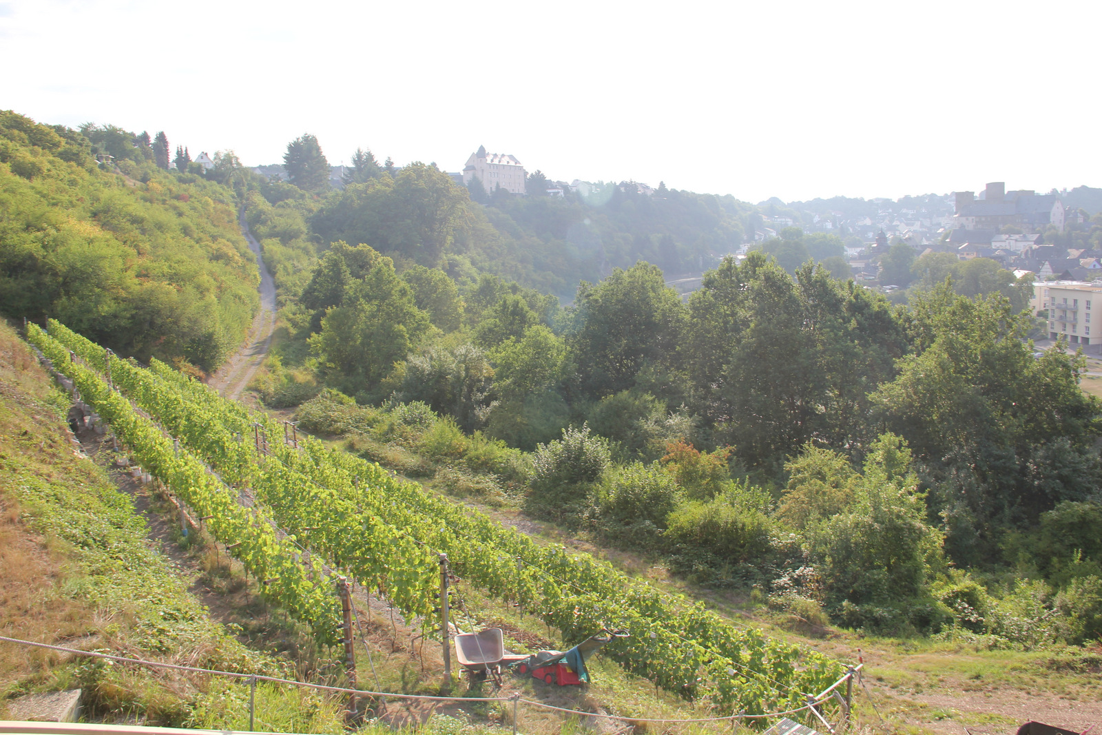
The Lahn valley was once an important wine growing region. In the 17 century vineyards extended as far upstream as Marburg. Today, only two commercial ones remain, Obernhofer Goetheberg and Weinährer Giebelhöll, although abandoned ones are still visible at Dausenau and Nassau, and enthusiasts have recently been replanting at Runkel.
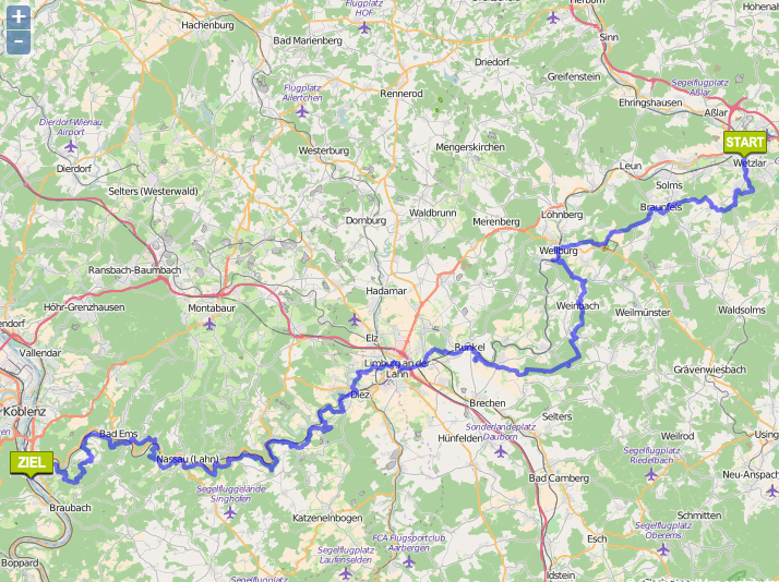
The distance boards on the bank measure from the historic border between Prussia and Nassau, a few km downstream of Giessen, but the river is canoeable from Marburg, 37 km above that point.
Click here for another account of the same trip.
WARNING – We made this trip in May 2015, and although I composed this blog the following winter, for some reason I never posted it. Perhaps I wanted to check the mileages or some other detail. Now I’ve forgotten. Please forgive errors.
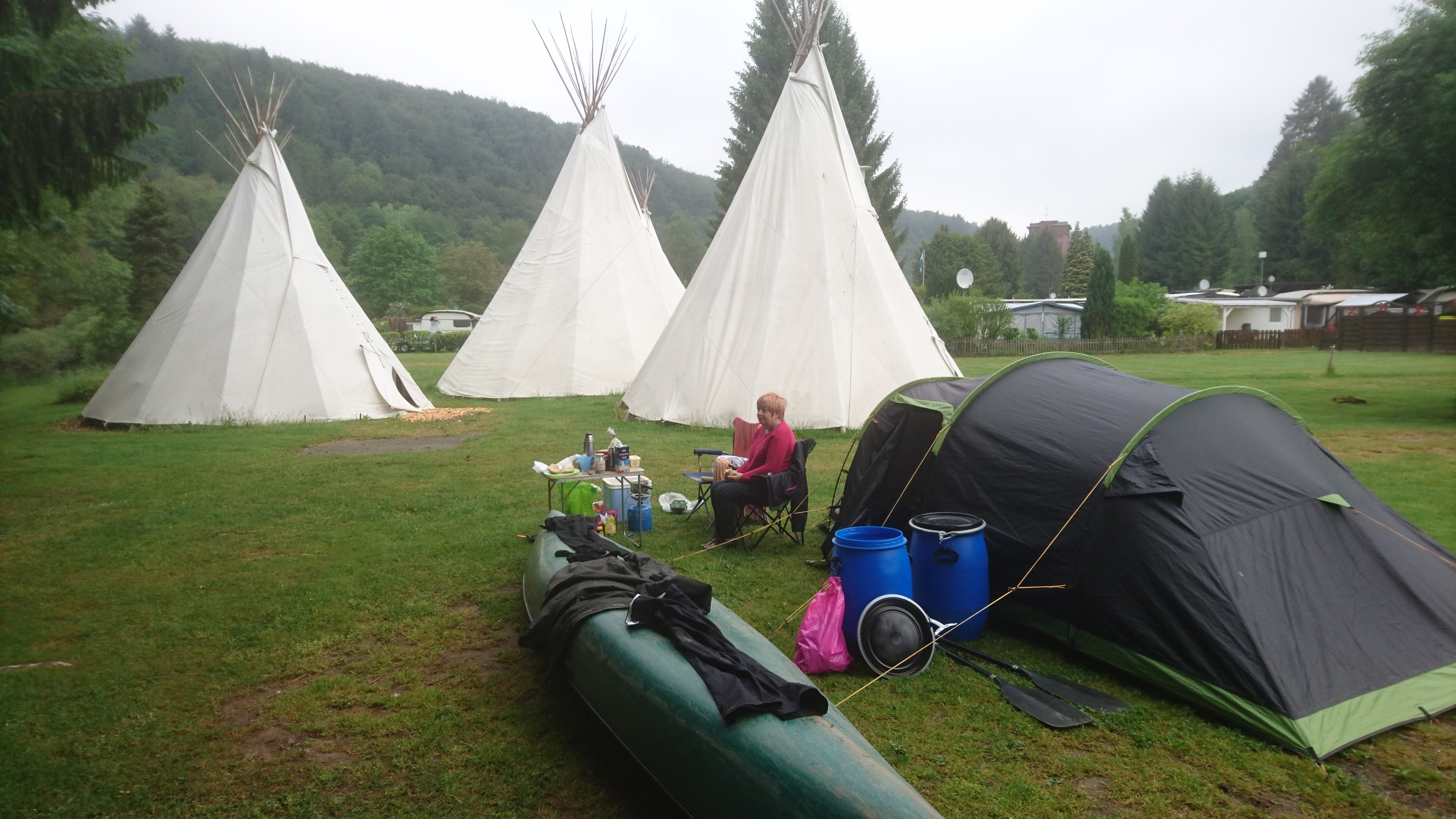
9.5 km – Camping Wetzlar (click here). Car park and easy launch spot.

10.5 km – Railway and Wolfgang-Kuhle-Strasse bridges adjacent to each other.


11 km – The beautifully curved E44 bridge.


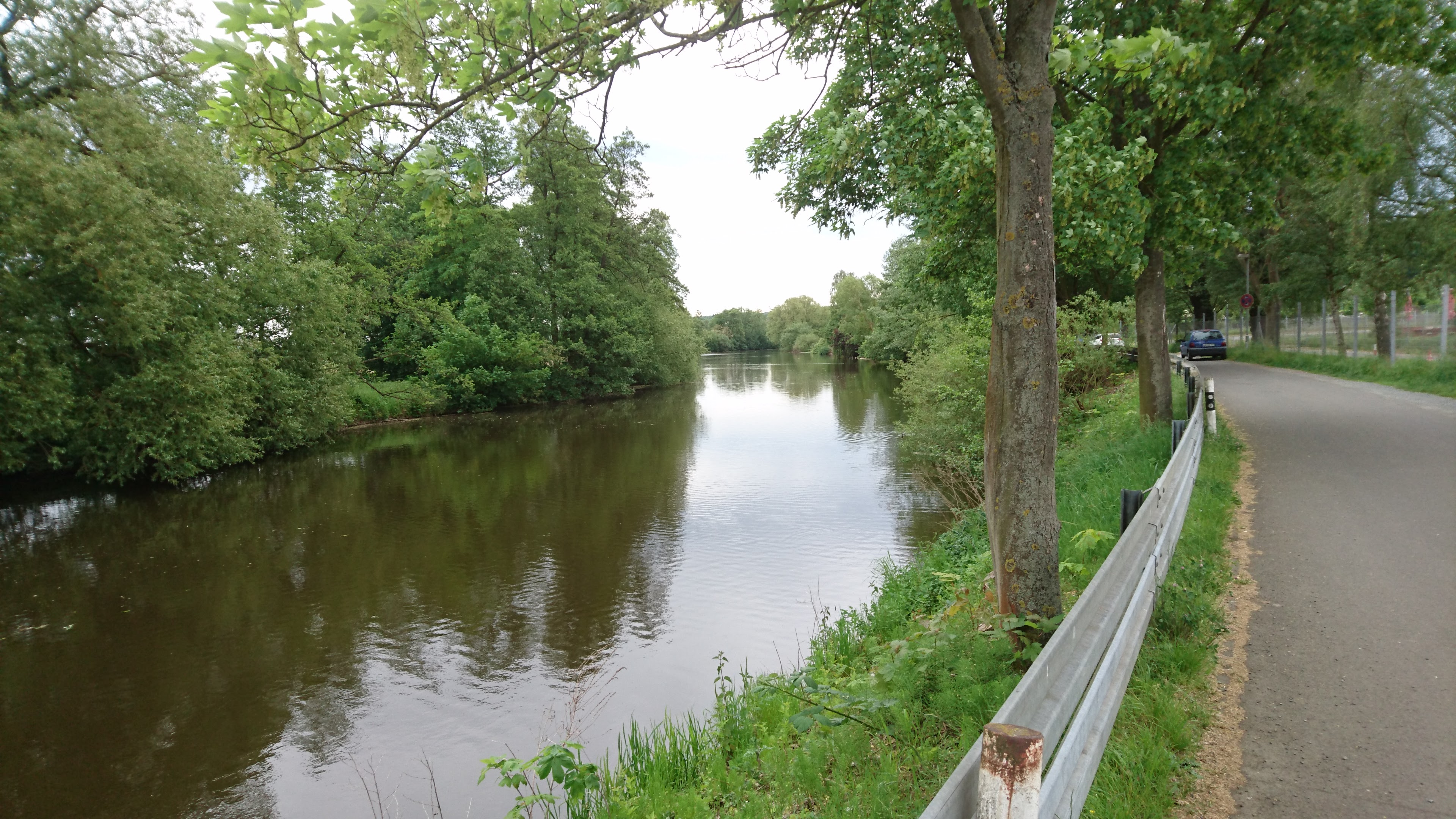
11.4 km – Brukenstrasse bridge. Weir below. Canoe shoot right. Gentle slope. Easy.

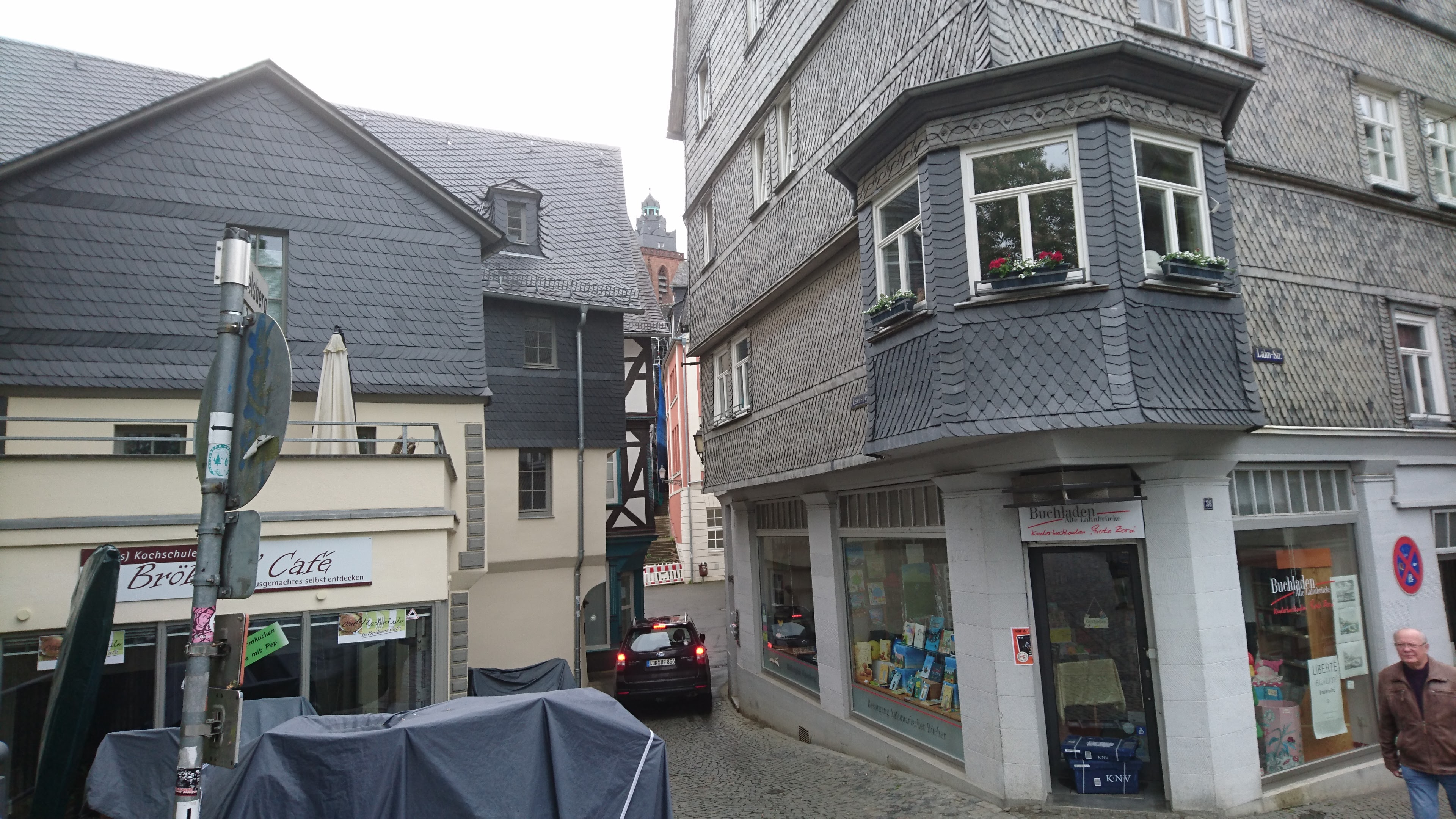
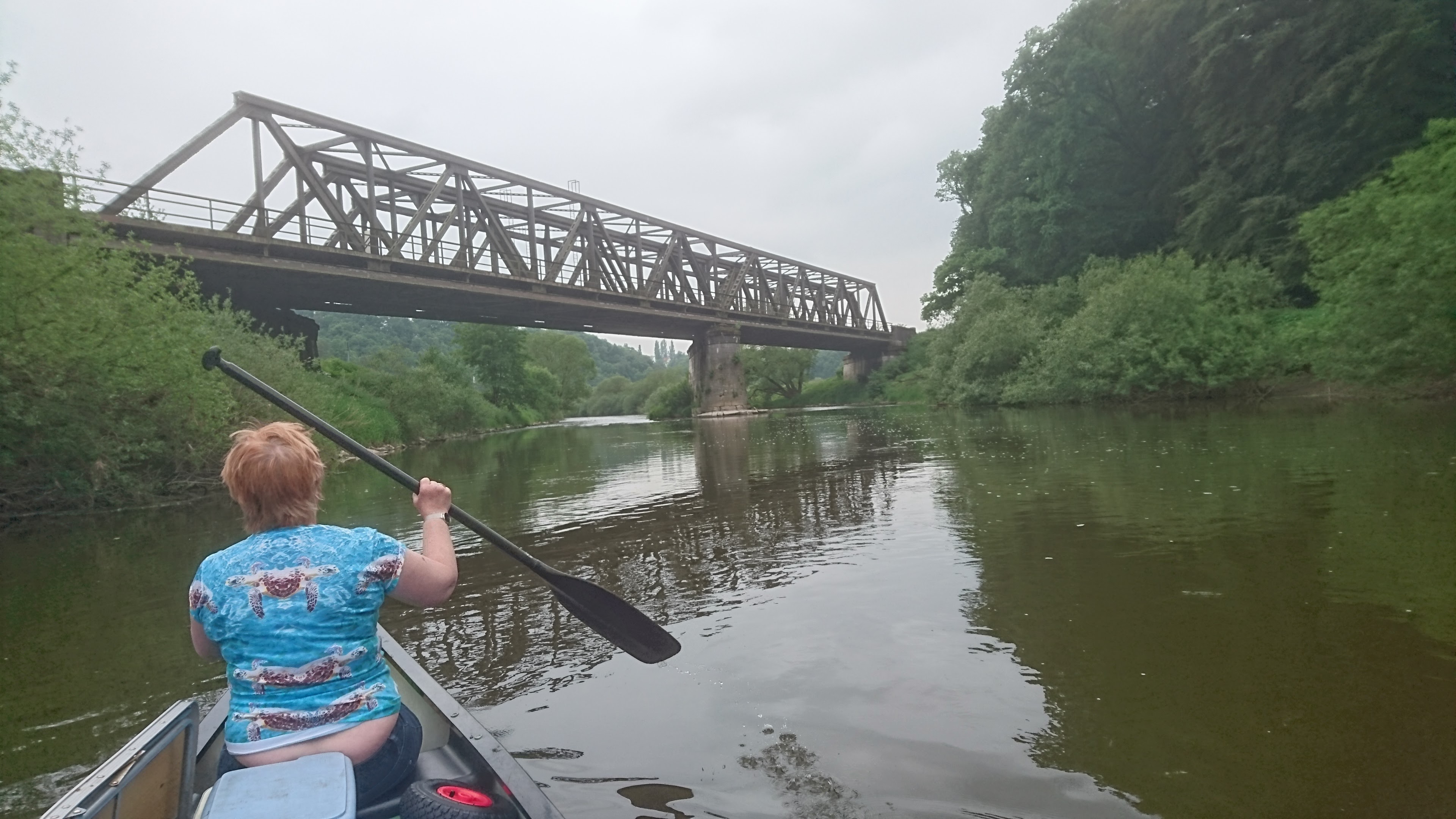
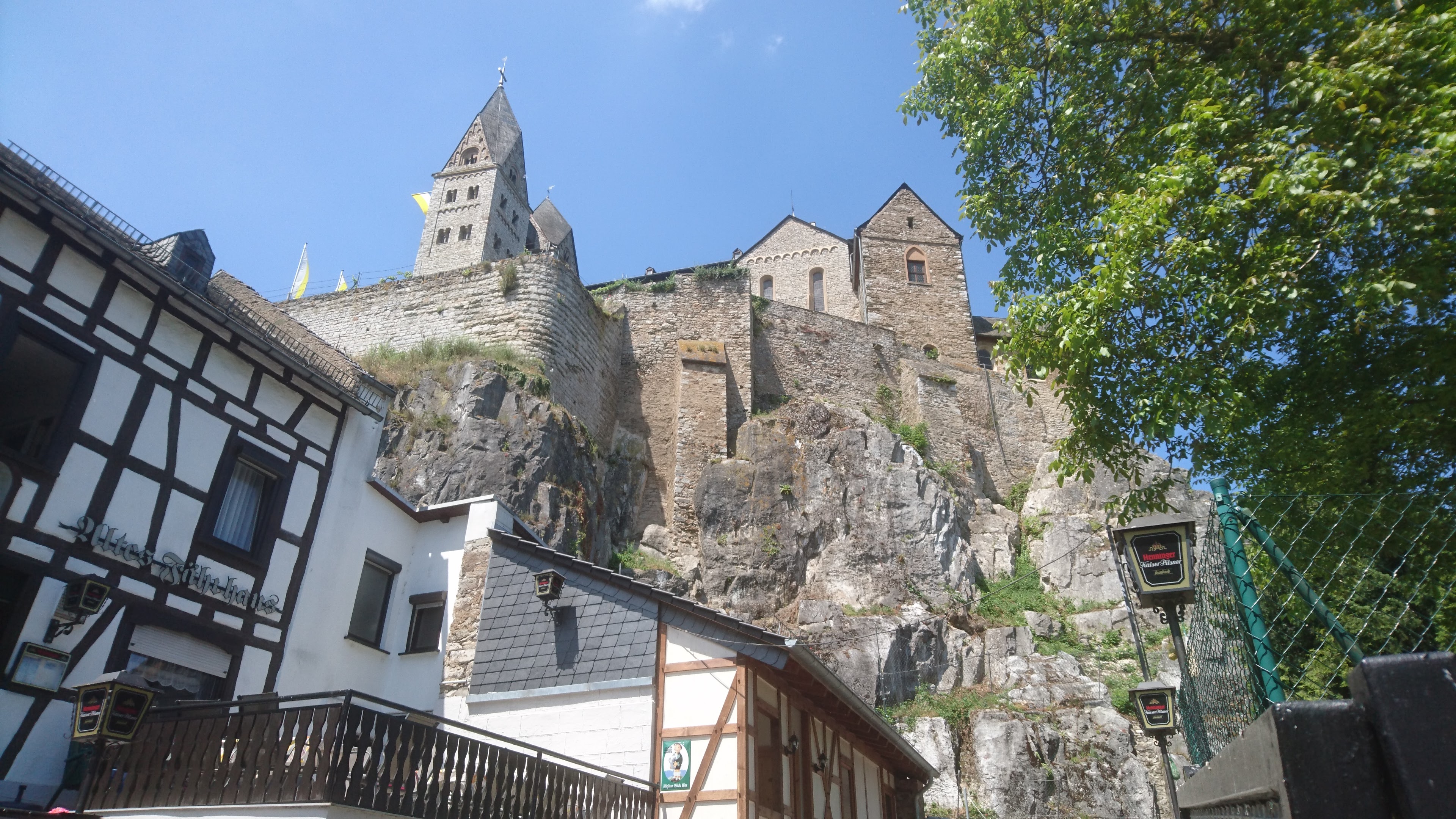
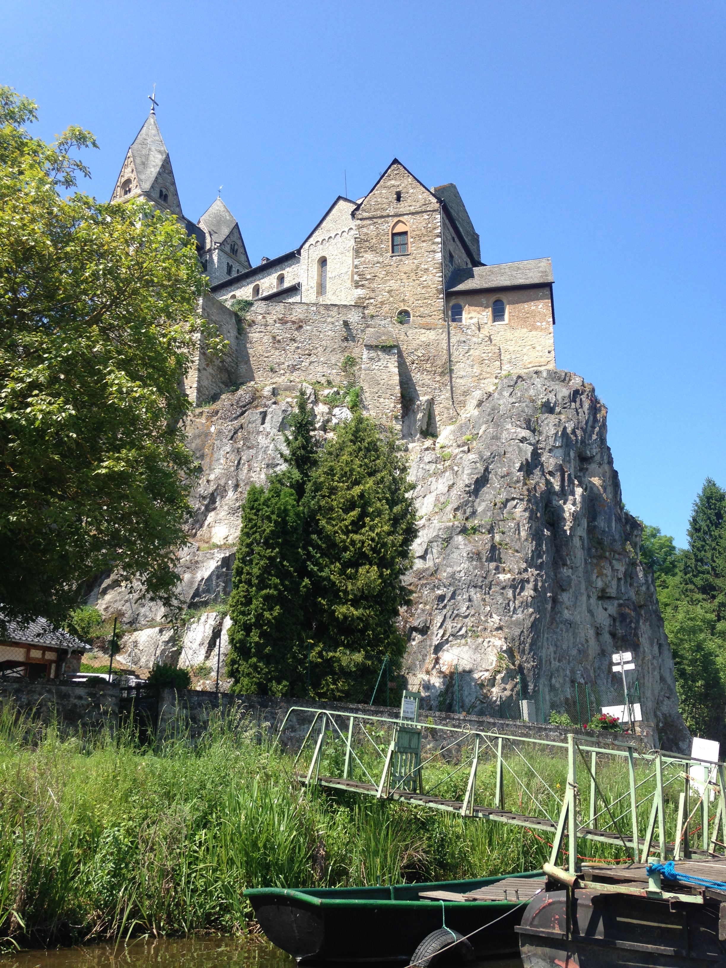
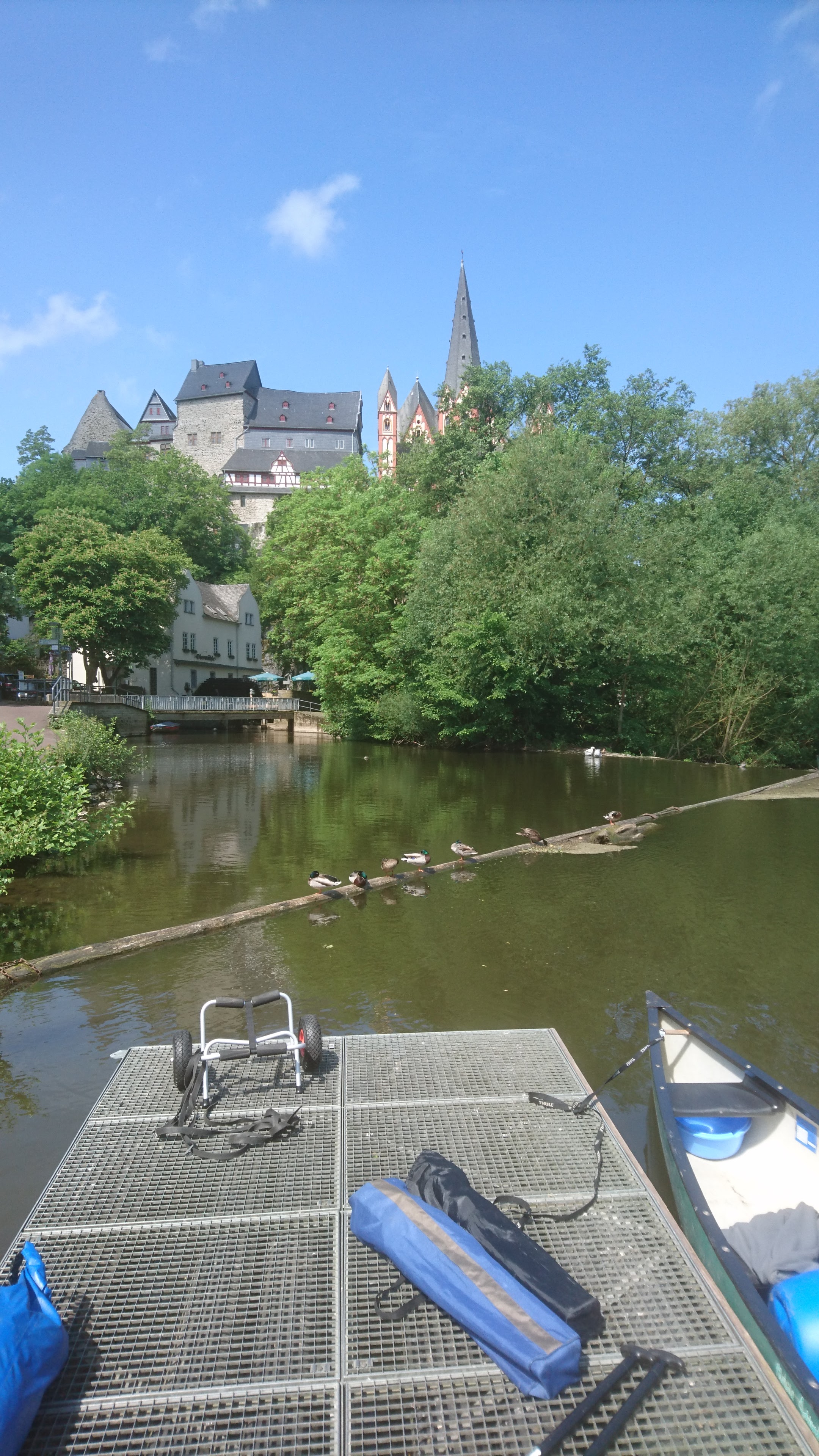
11.8 km – Arno Riedl pontoon footbridge (1985). Sculpture park, Old Town and Cathedral (Dom) left.


The Cathedral of our Lady, at the start of the Lahn Camino de Santiago, has a statue of St James on the left of the door of the south tower. The first stage of the camino heads south away from the river before turning west at Kirschenwaldschen to pass through Nauborn, Laufdorf, and Solms-Oberndorf-Braunfels before rejoining the river at Weilburg. Generally the bank of the river was boggy and difficult going so pilgrims kept to higher ground.

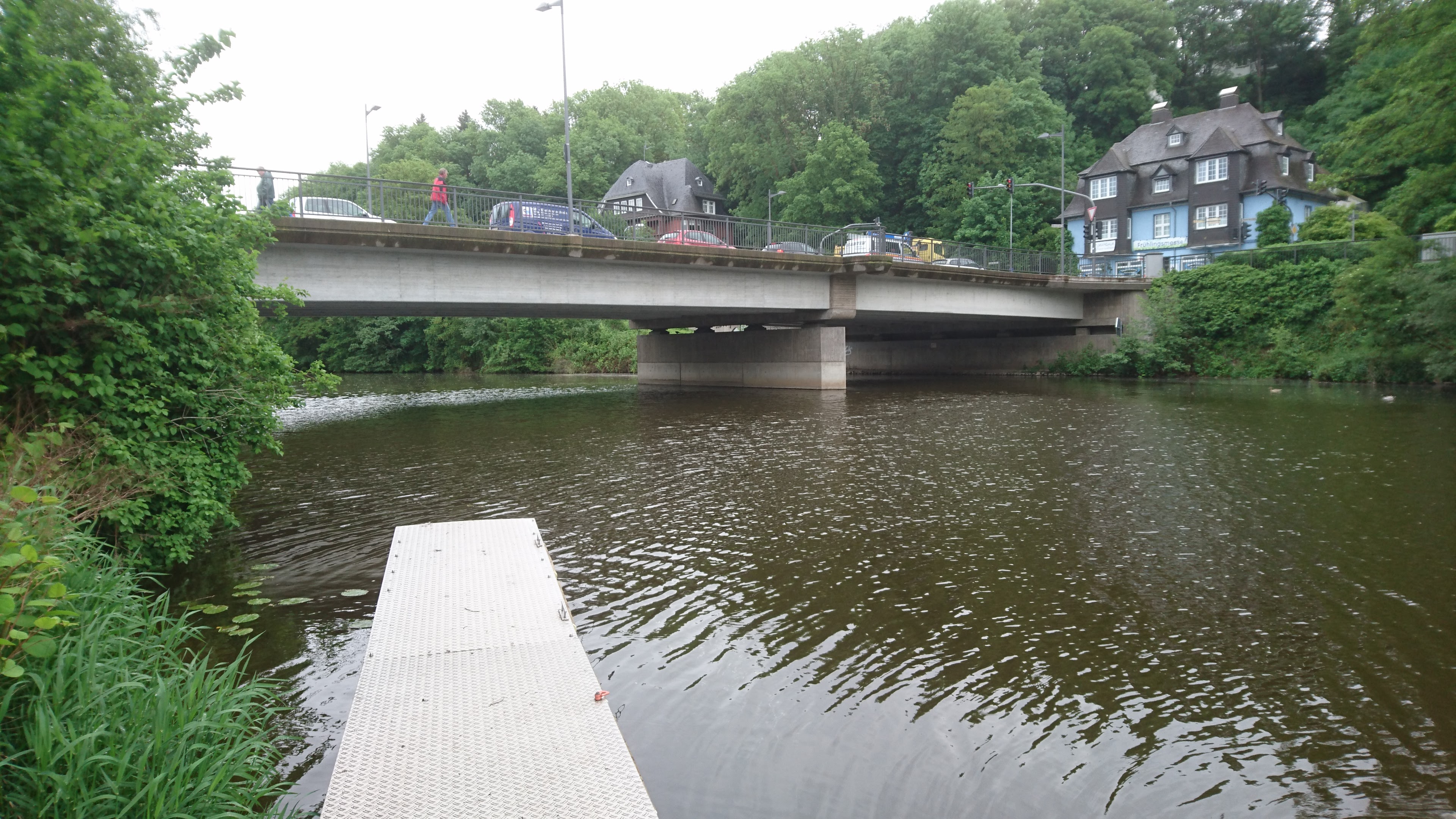
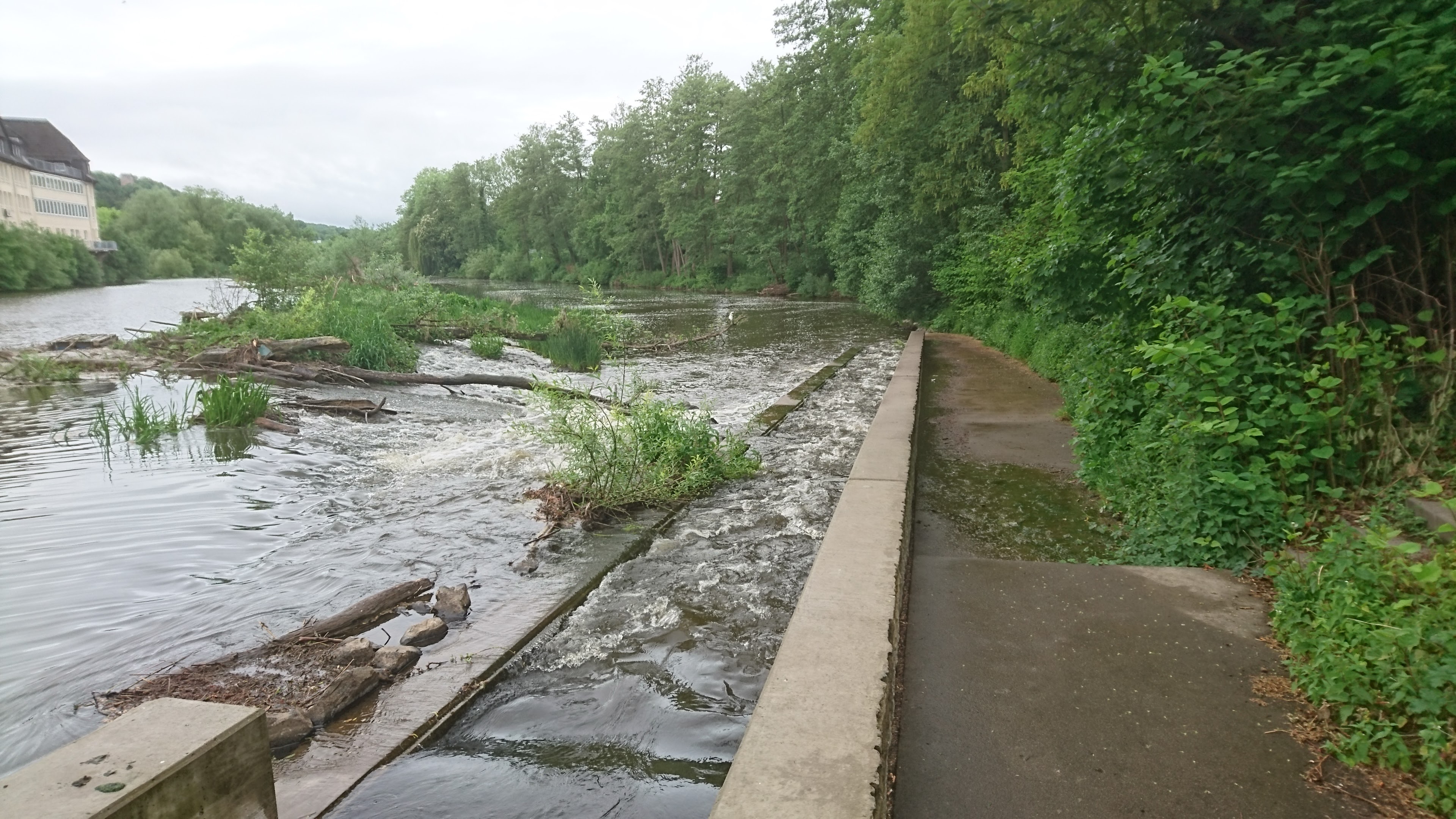
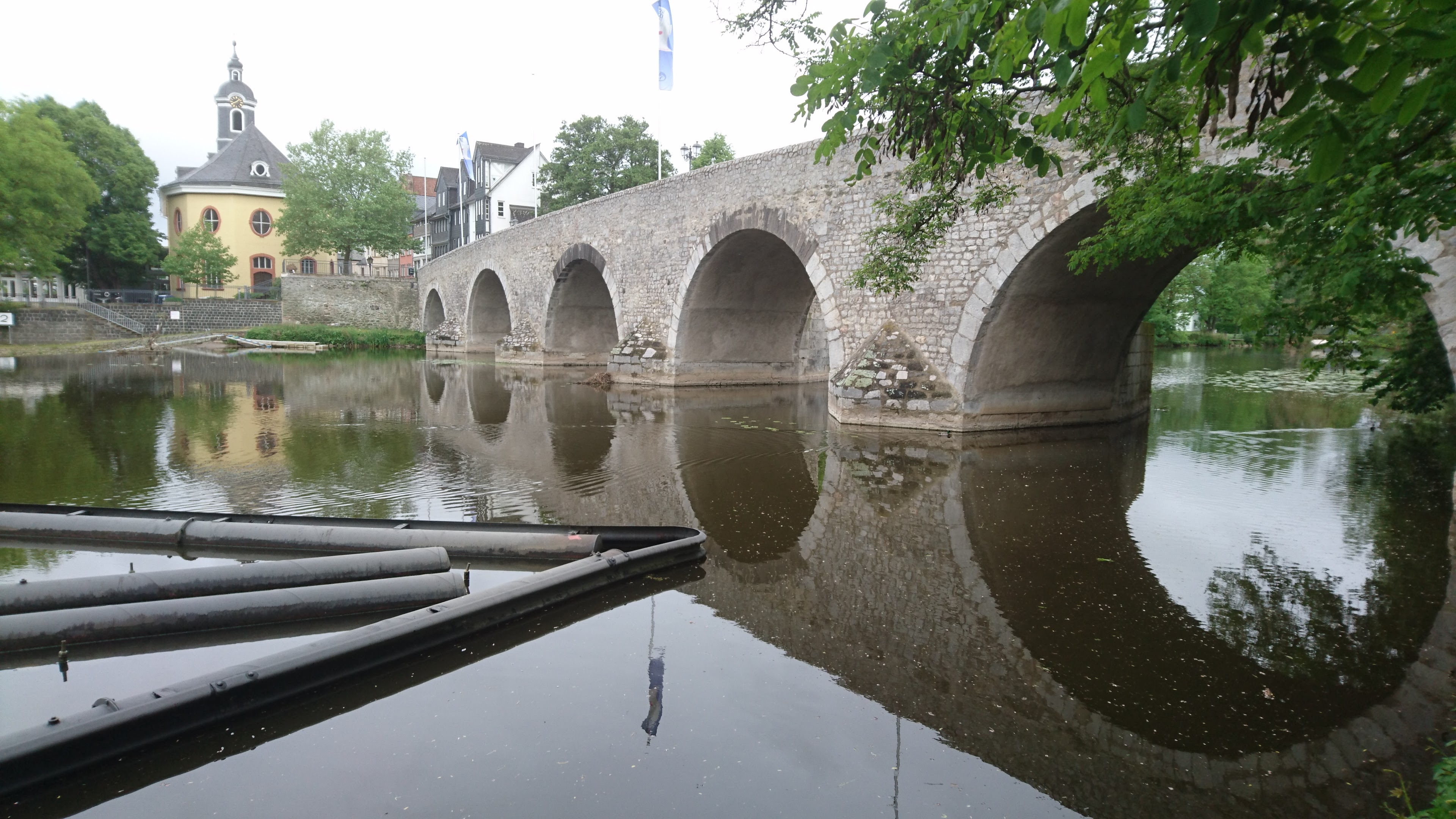
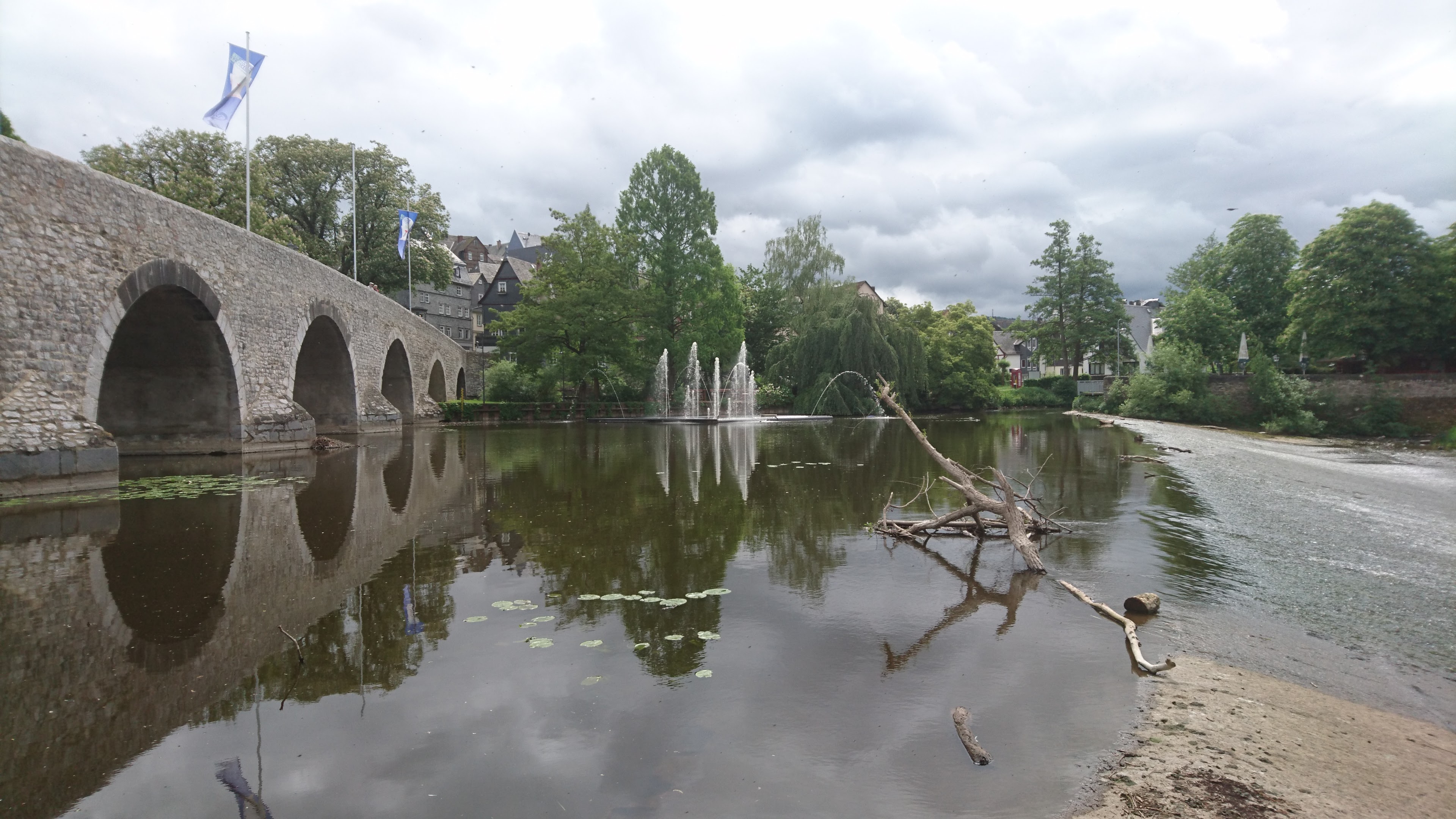
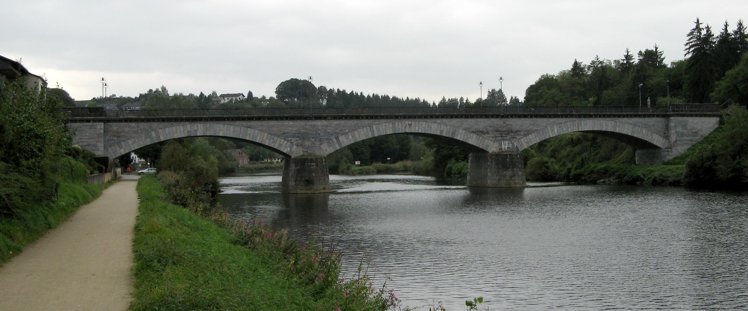
12 km – Old bridge with weir immediately after. Portage on rollers right. Medieval bridge believed to have been built late 13th century. Defaced by fountains just below and a garish blue puppy dog statue on the bridge. Don’t miss Restaurante al Camino (click here)


12.1 km -Road bridge

12.6 km – Suspension footbridge Muhlegraben

12.9 km – River Dill enters right

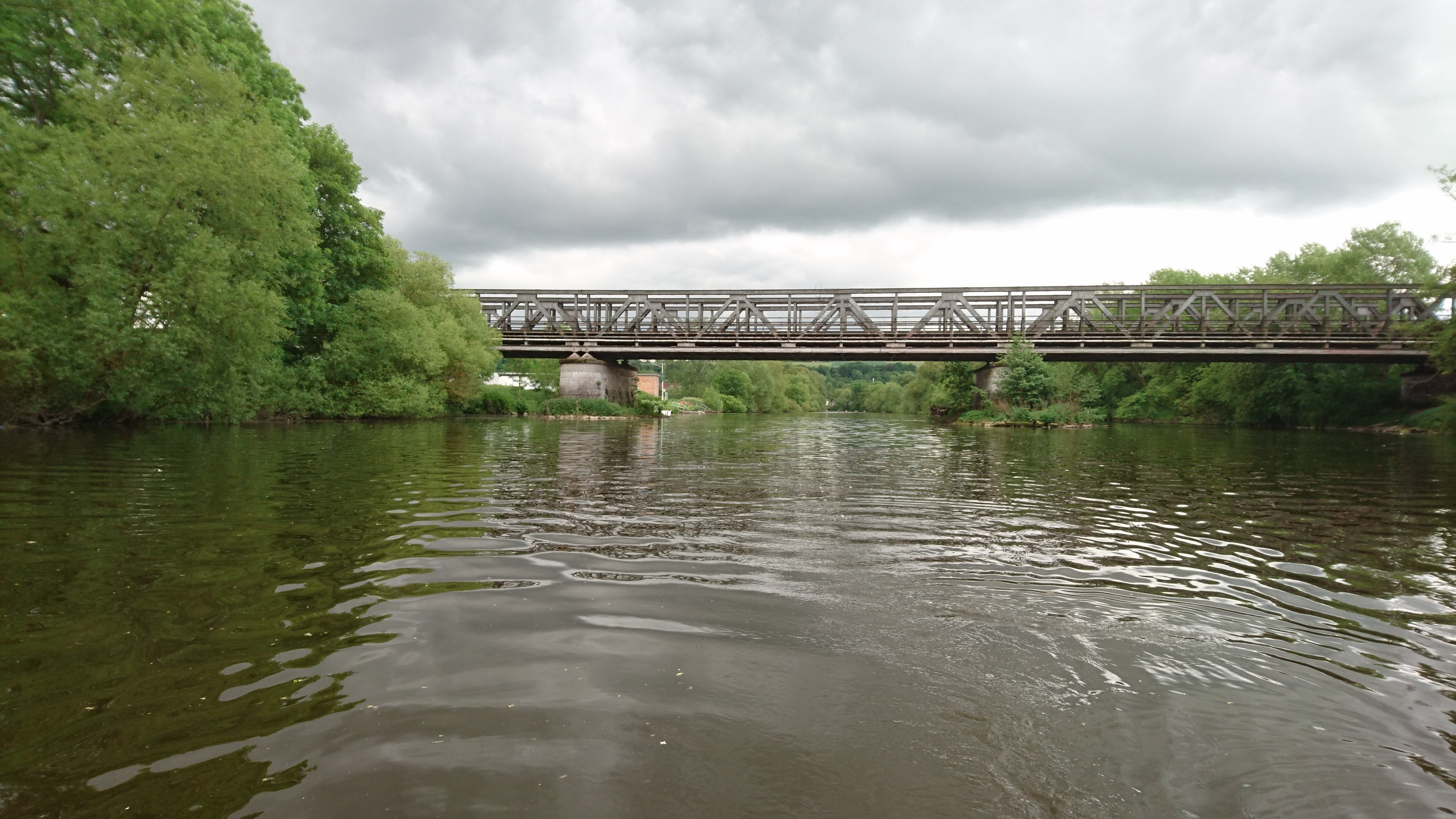
13.8 km – Railway bridge
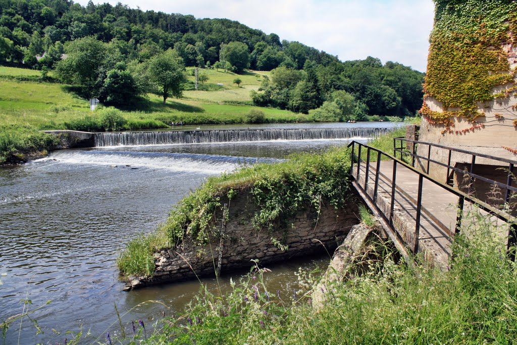
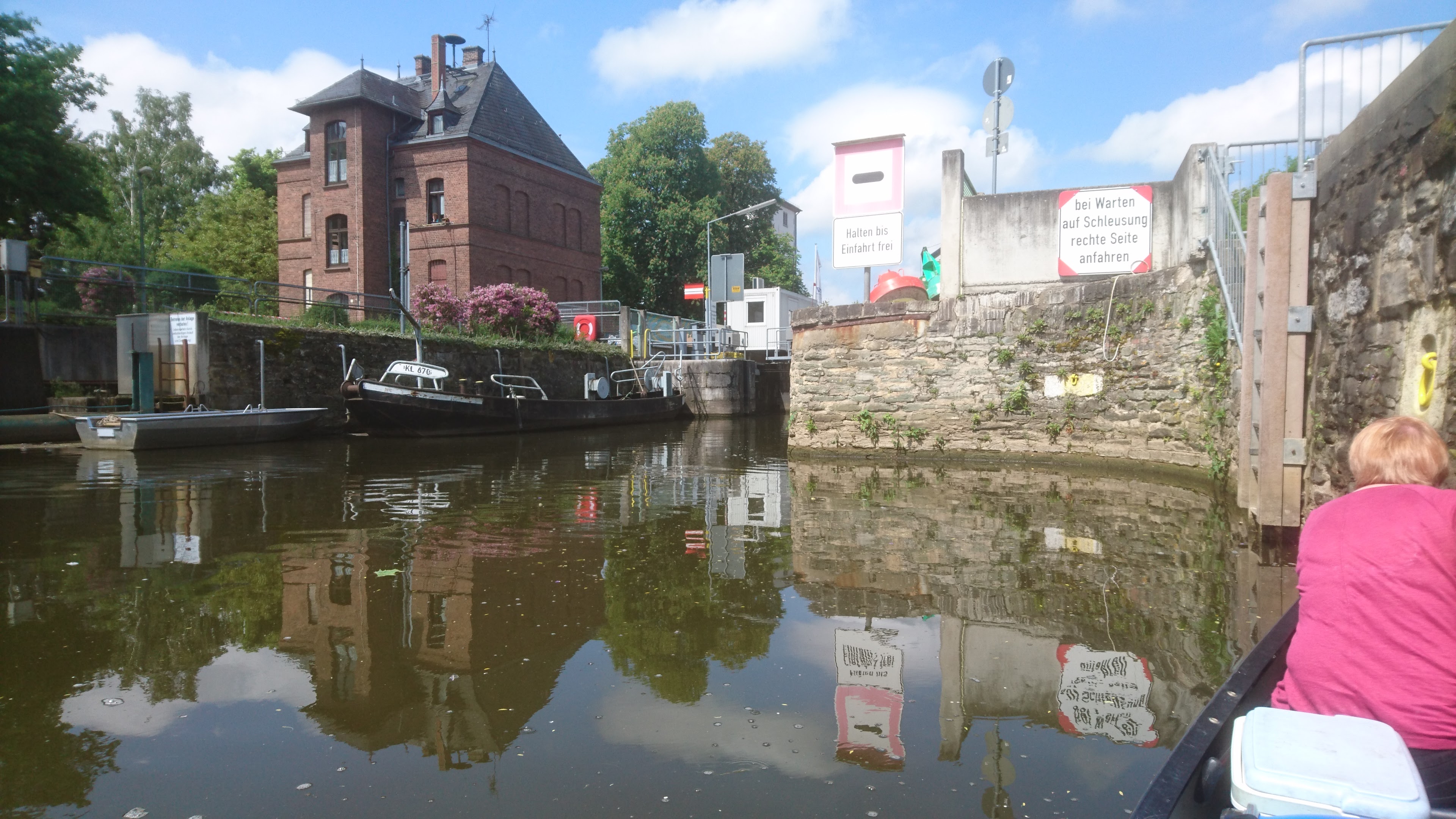
16 km – Weir left. Lock Altenburg right channel.


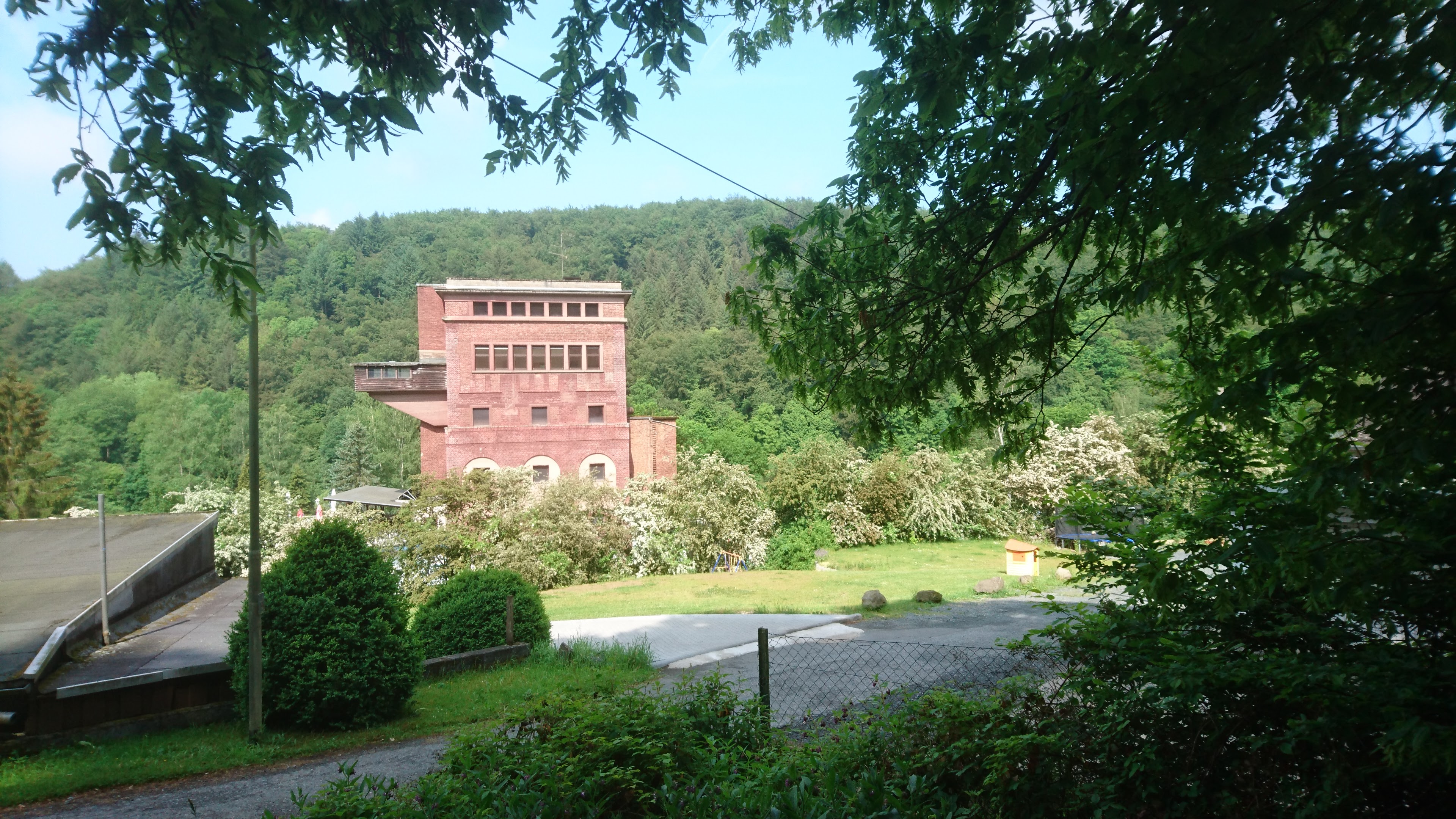
18.7 km – Albshausen left, Oberbiel right. River splits into three channels. Right to weir. Middle to hydro electric power station. Left to lock channel.
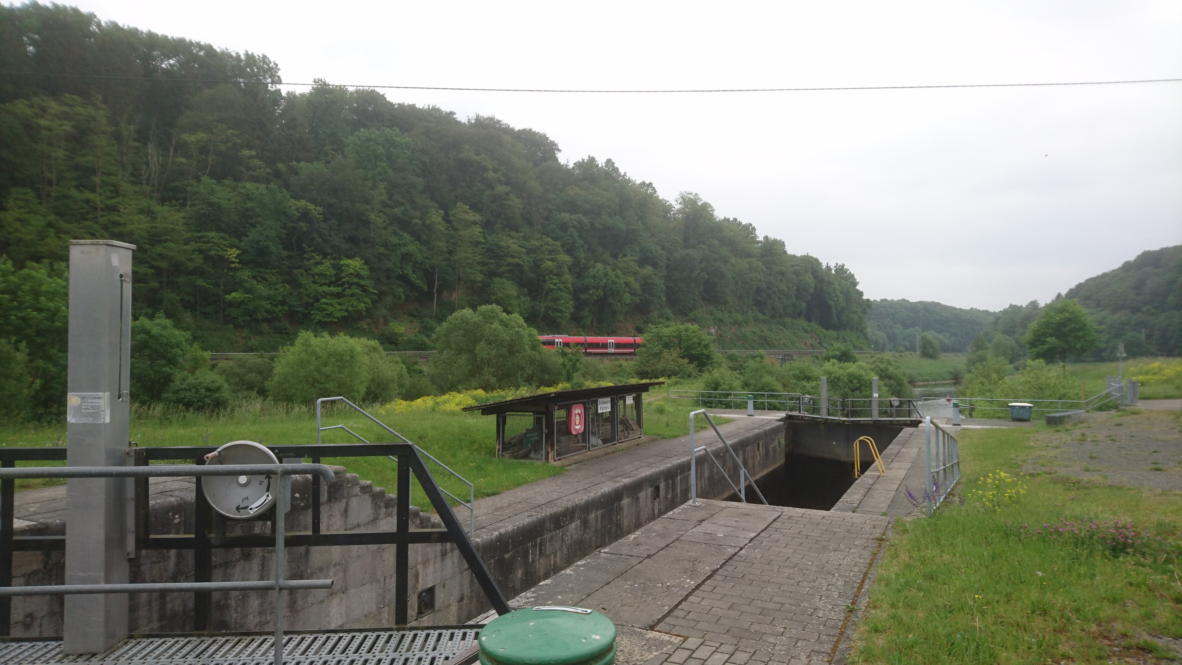
19 km – Oberbiel lock
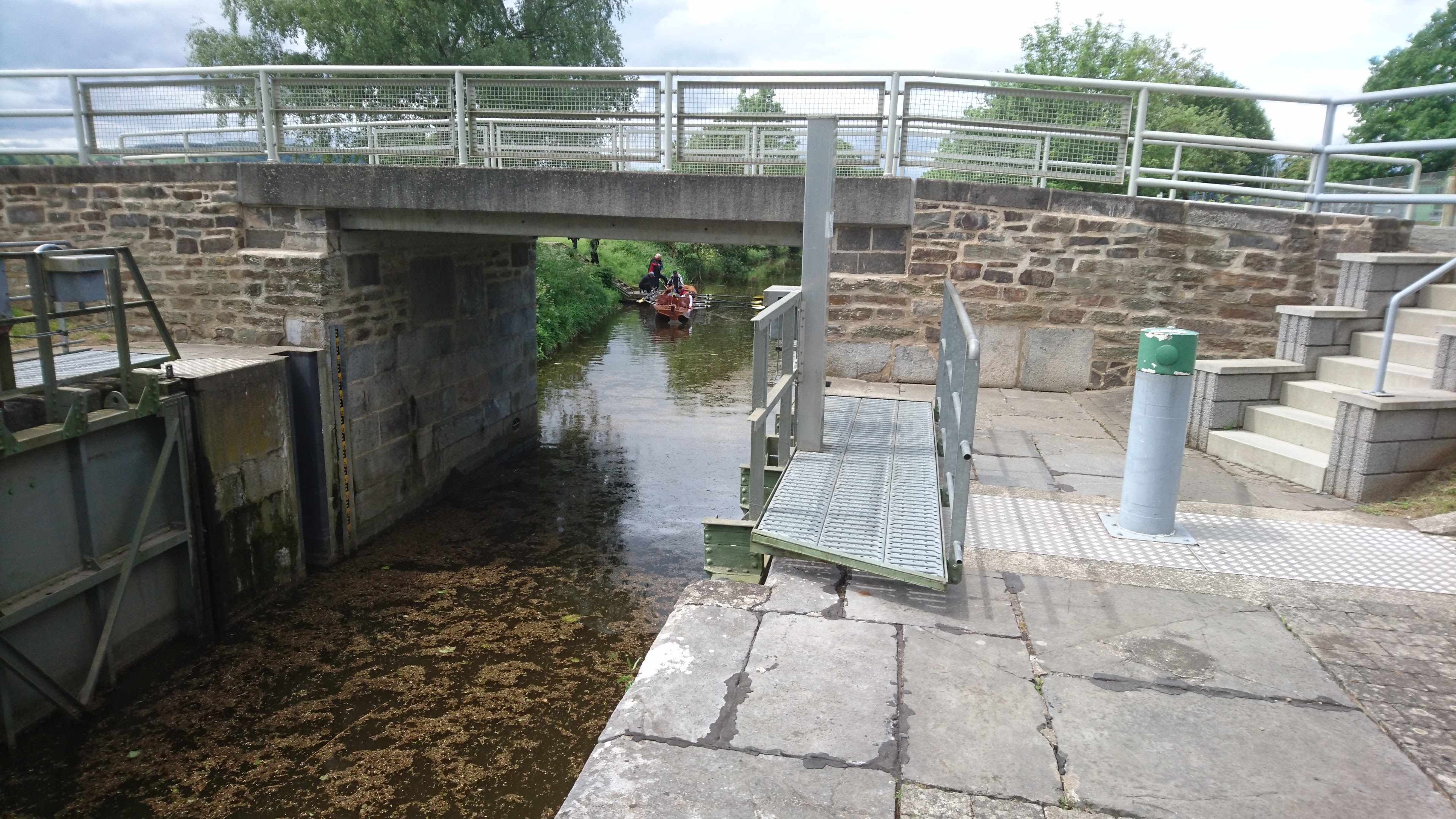
20 km Niederbiel lock.
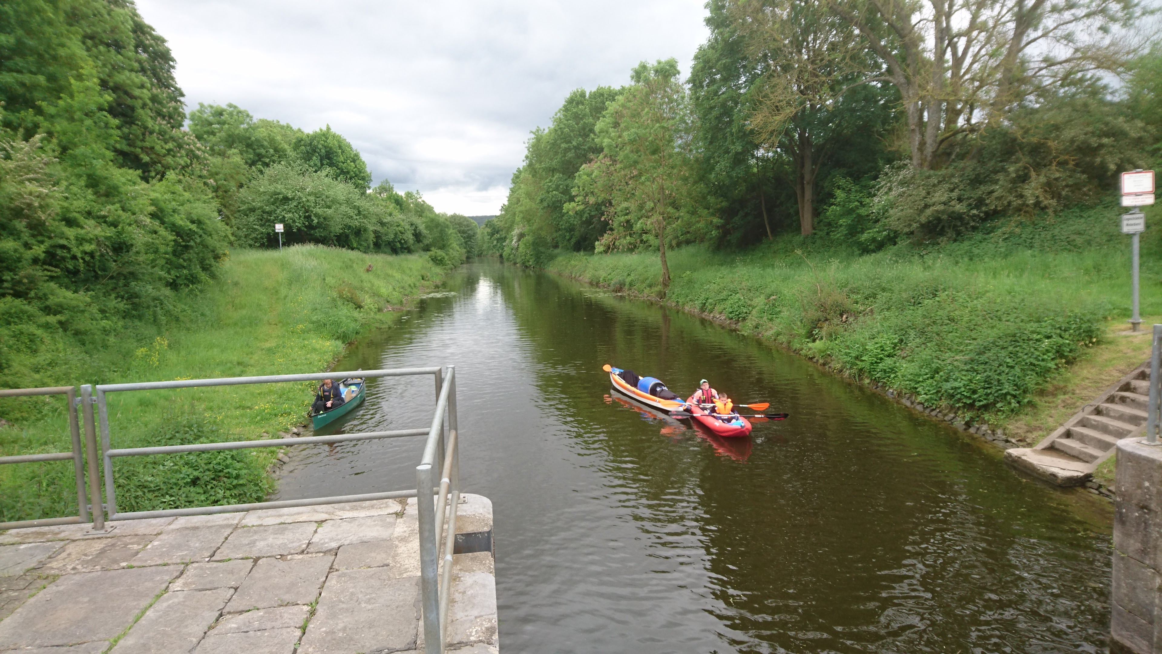
Between here and Selters the river flows well with numerous tiny rapids and riffles.
20.5 km – L3283 bridge
23.5 km – Lahntours camping right (click here).
24 km – Footbridge and 12.8 km – E44 bridge

25 km – Brukenstrasse bridge. Leun right. Some little rapids below.


The river leaves the Hessian mountains enters the Rhenish slate massif through which it will pass for the rest of its course.
26 km – Camp right after Leun http://www.stell-und-zeltplatz-lahnwiese-leun.de/ Bivouac German style; toilet, shower and someone comes round to collect the fees about 6pm.

28 km -Railway bridge

29 km – E44 bridge

30 km – Biskirchen right. Look out for turtles

34 (check) km -Sewage pipe bridge

35 km Selters left followed by

35.9 km – Lohnberg footbridge

36 km – Lohnburg weir and mill right. Lock left


38 km -Ahausen bridge


39.5 km -Railway bridge. Weilburg right


From Weilburg the camino follows the south bank for a mile or so before leaving to run over higher ground to the southwest until rejoining at Vilmar.

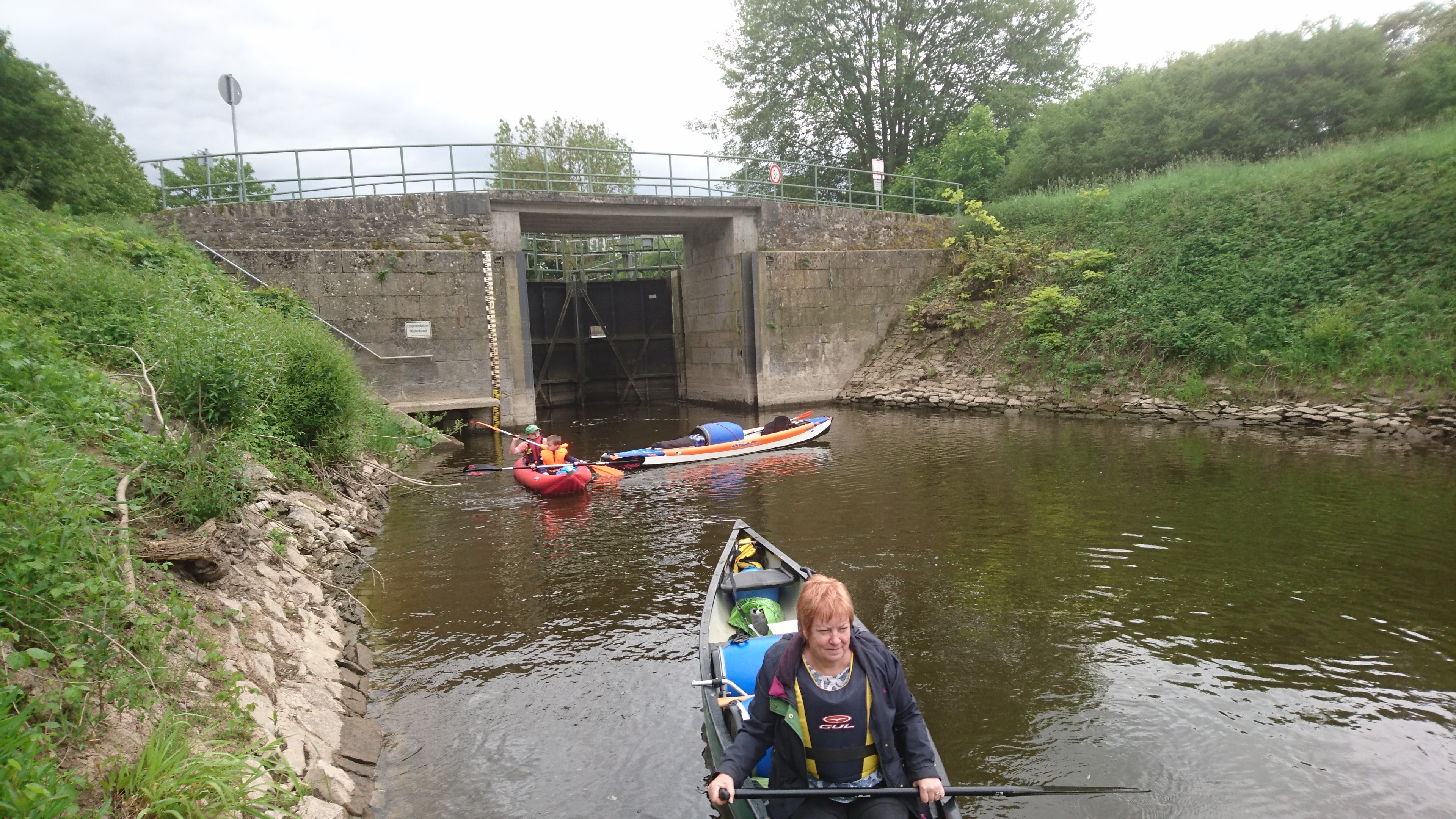
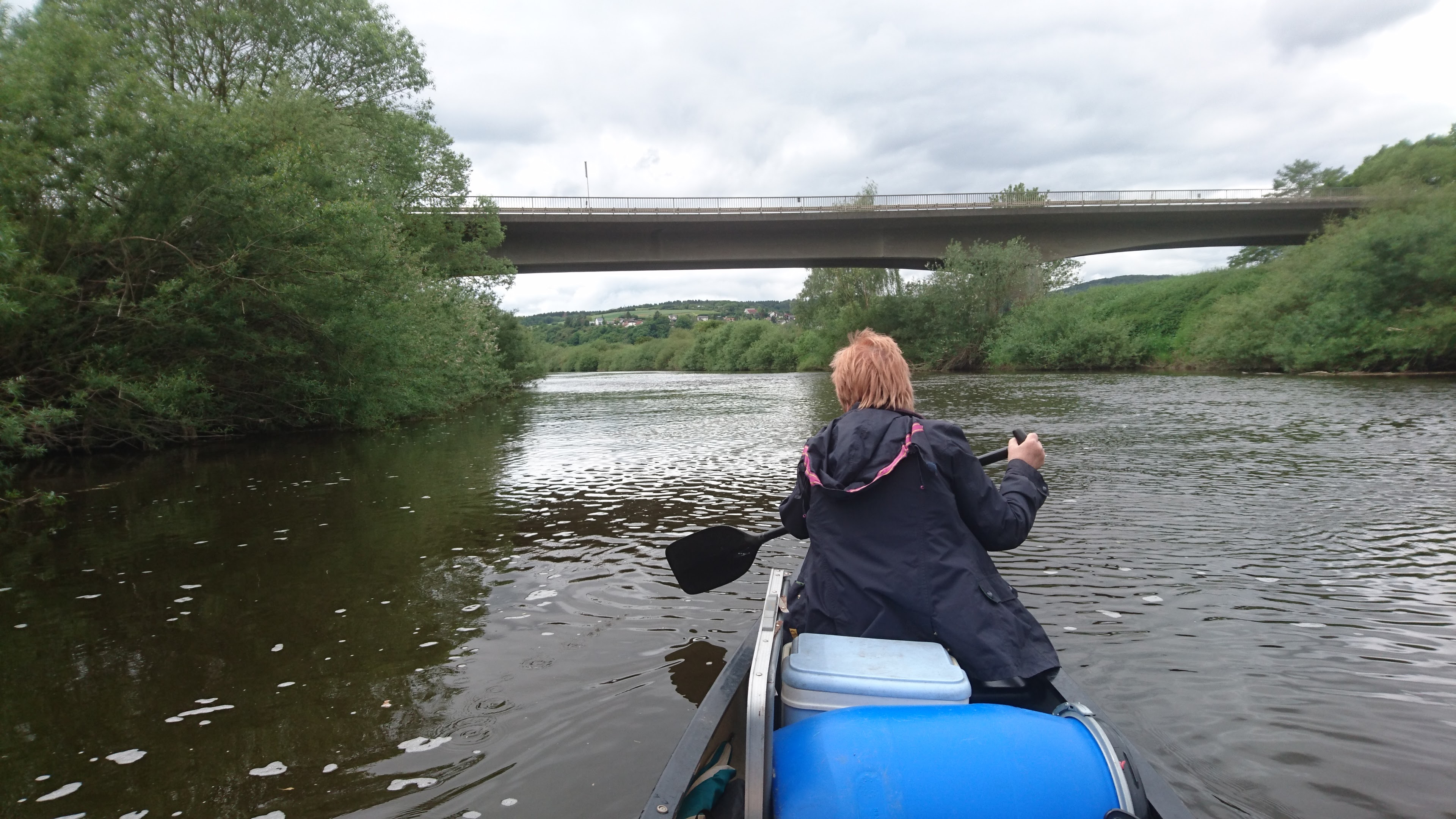
39.7 km – Weilburg tunnel left. The distance markers on the bank follow the main river course. So you save about 2km paddling distance by going through the tunnel. The tunnel is large and airy and about 200 metres long. The far end is visible as soon as you enter, albeit partially obscured by the lock gate at the exit. There is no landing stage above the lock so you have to climb directly up a metal ladder to work the gates. Fine for two in an open canoe but would be tricky for a single person in a kayak.

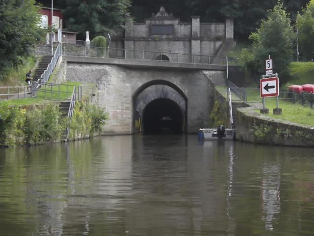

Ignore main channel under 456 road bridge to weir, castle, old Lahn bridge. Beyond that steel footbridge


41.5 km – Emerge from Weiburg lock at downstream end of the tunnel

Bivouac campsite right bank opposite the tunnel. There’s said to a plaque on the left bank marking the site of the crash of Zepellin Z II on 24 April 1910 (more here). I couldn’t see it from the river.


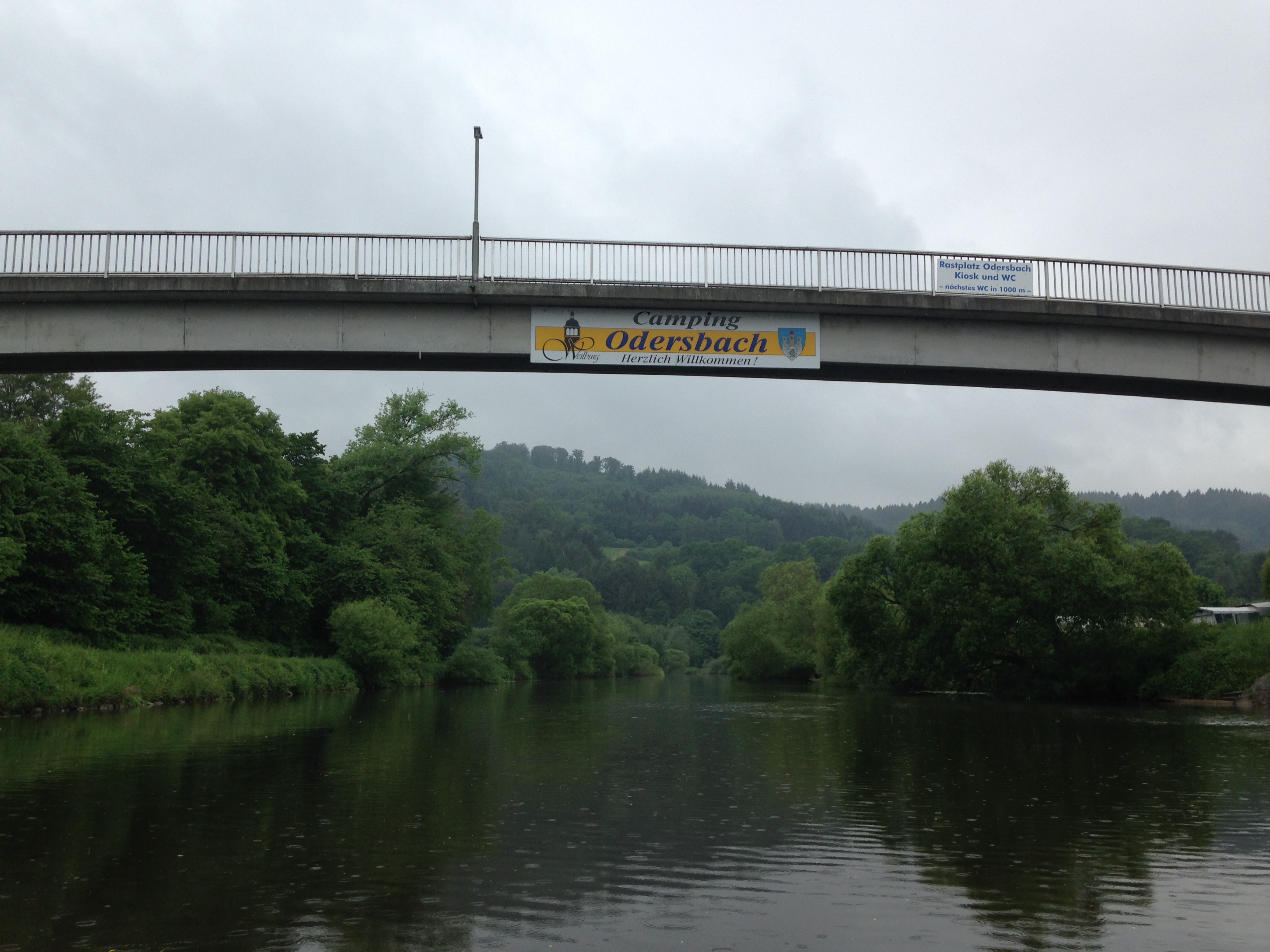
44 km – Footbridge (Odersbach right, Kirschofen left) followed by Camping Odersbach right (click here)

45.5 km – Kirschofen weirs left (an unusual pair of weirs in series). Keep right for Kirschofen lock

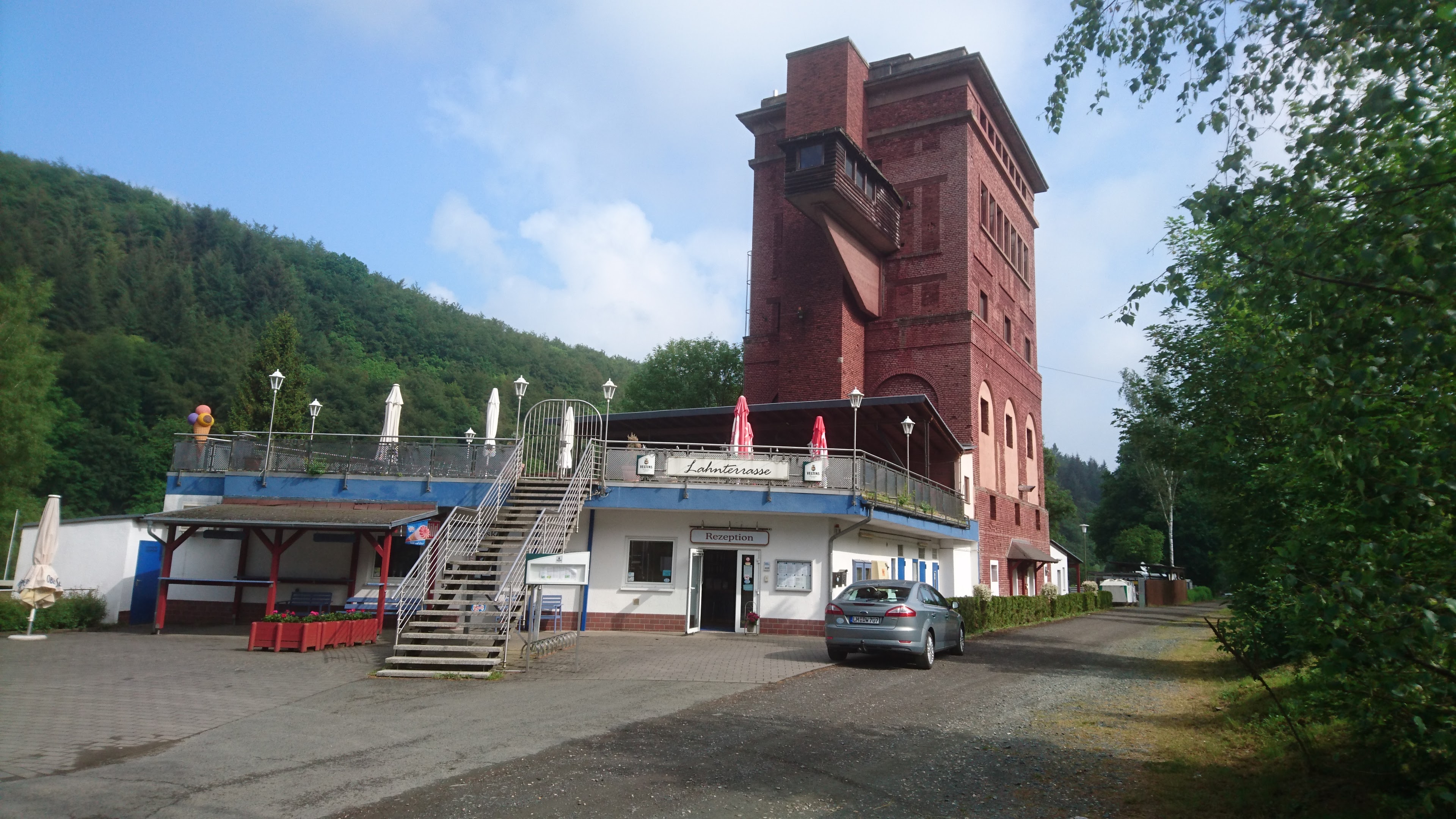
48 km – Camping Graveneck left http://www.camping-graeveneck.de/ Lovely site adjacent to old railway tower and sidings.


48.5 km – L3452 bridge

50.5 km – Furfurt town left. Followed by Furfurt weirs, another double set, left. Furfurt lock right.


Small rapids below Furfurt

42.7 km -Bridge. Aumenau right. Access right.


44.6 km – Railway bridge

47 km – Arfurt right

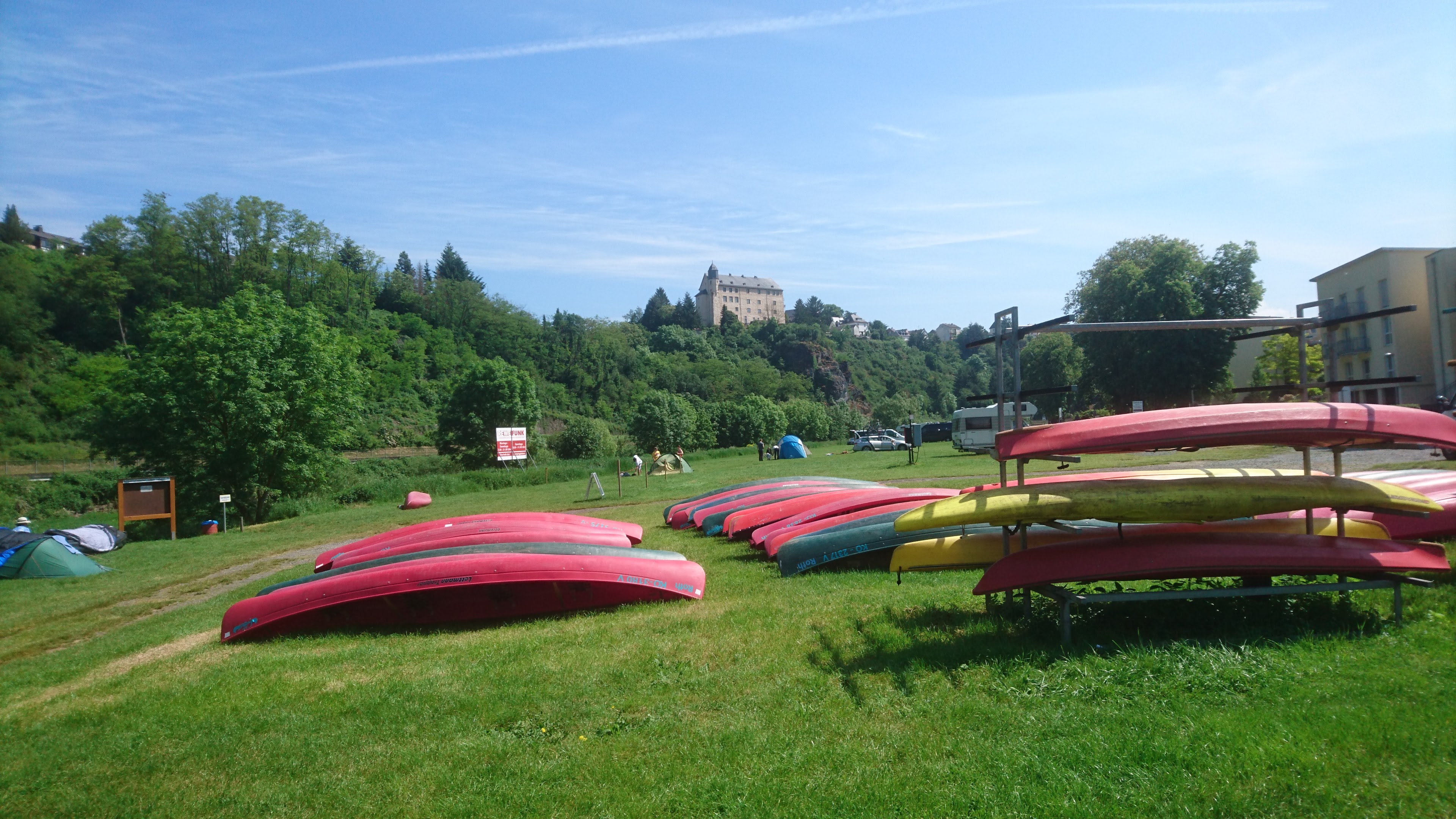
48.2 km – Camping Runkel right a bivouac site. Don’t confuse with the much larger Campingplatz Runkel near the mouth of the river at Lahnstein.
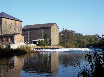
62.5 km – Unica quarry right, Marble bridge. Followed by Vilmar left. Marble from the abandoned Unica quarry, now a museum (click here) was once a popular ornamental stone. It was used in the Hermitage in St Petersburg, the Kremlin and the lobby of the Empire State building


62.8 km – Weir. Power station left. Lock right.


The camino joins the river at Vilmar, and apart from a couple of short cuts follows the bank more closely now.

61.2 km – The precipitous limestone cliff left is topped by a stature of King Konrad 1st


65 km – Runkel. Slipway right. Wine making in Runkel, which had gone on for many hundreds of years, ended in about 1930. Over the last few years a group of enthusiasts have attempted to revive it. They’ve planted a vineyard on the slopes directly opposite the campsite, and have produced a few vintages of Runkeler Roten or “Runkel Red”. More here. To be honest I couldn’t see the vineyard at all in 2016.

65.2 km – lock right. Weir left under Runkel bridge. The camino passes through Runkel


53.5 km – Camping left after the bridge (click here). A popular canoe hire start and finish point.


53.8 km – Steedener bridge


55 km – Railway bridge

59.2 km – L3448 bridge. Dehrn right. Marina right


72 km – Burg Dehrn right


60.9 km – Kurt-van-der-Burg footbridge 1989. Dietkirchen, dominated by St Lubentius Basilica on the limestone cliff right. Site of a ferry since 11th century. The small vineyard on the southern slopes below the Basilica, planted in 1998 makes Dietkircher-Lubentius-Ley, a sacramental red wine.


61 km – Emsbach stream joins left. The site of an ancient ford.
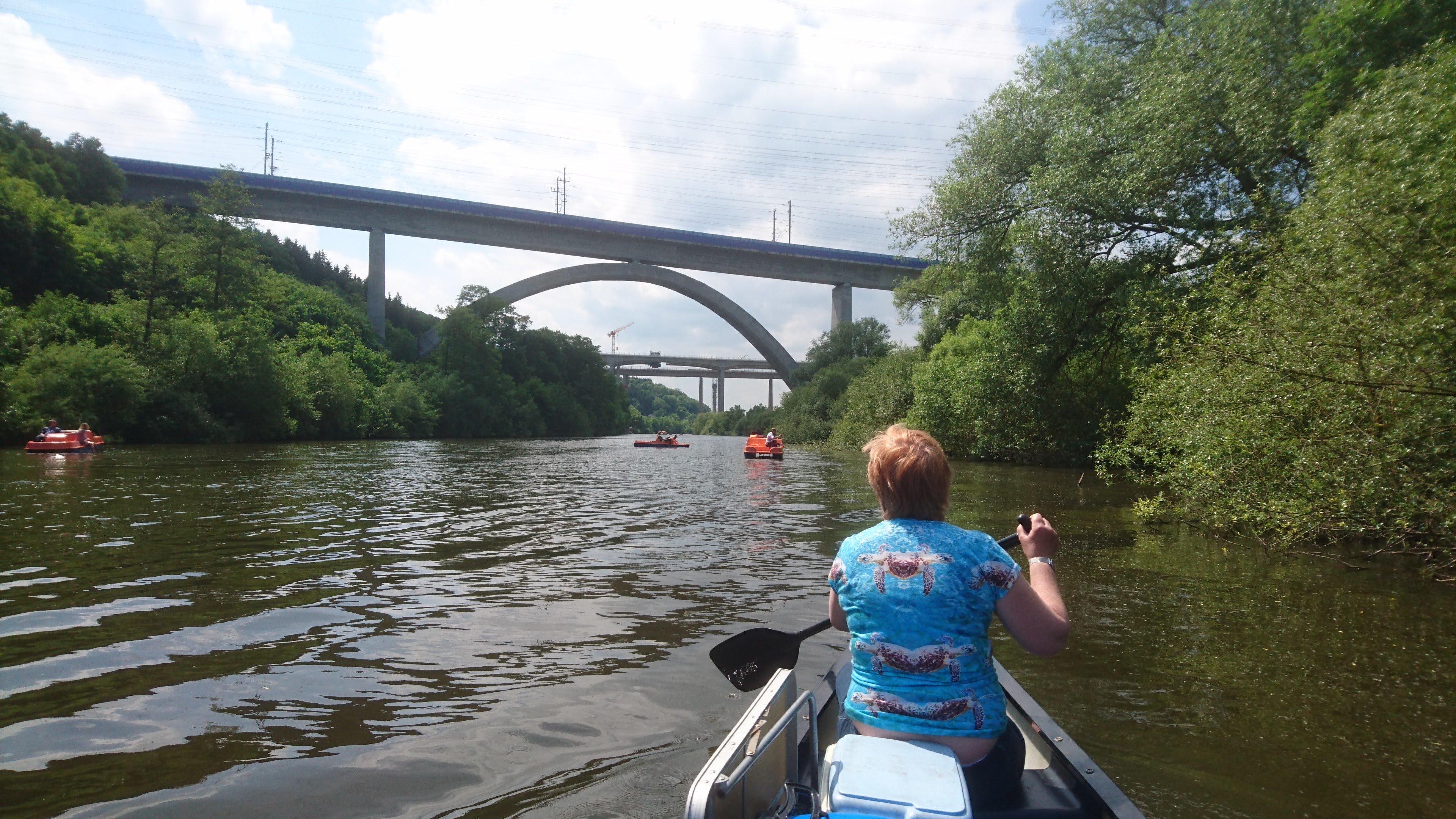
62.6 km – Intercity railway bridge followed by N3 motorway bridge, currently being widened.

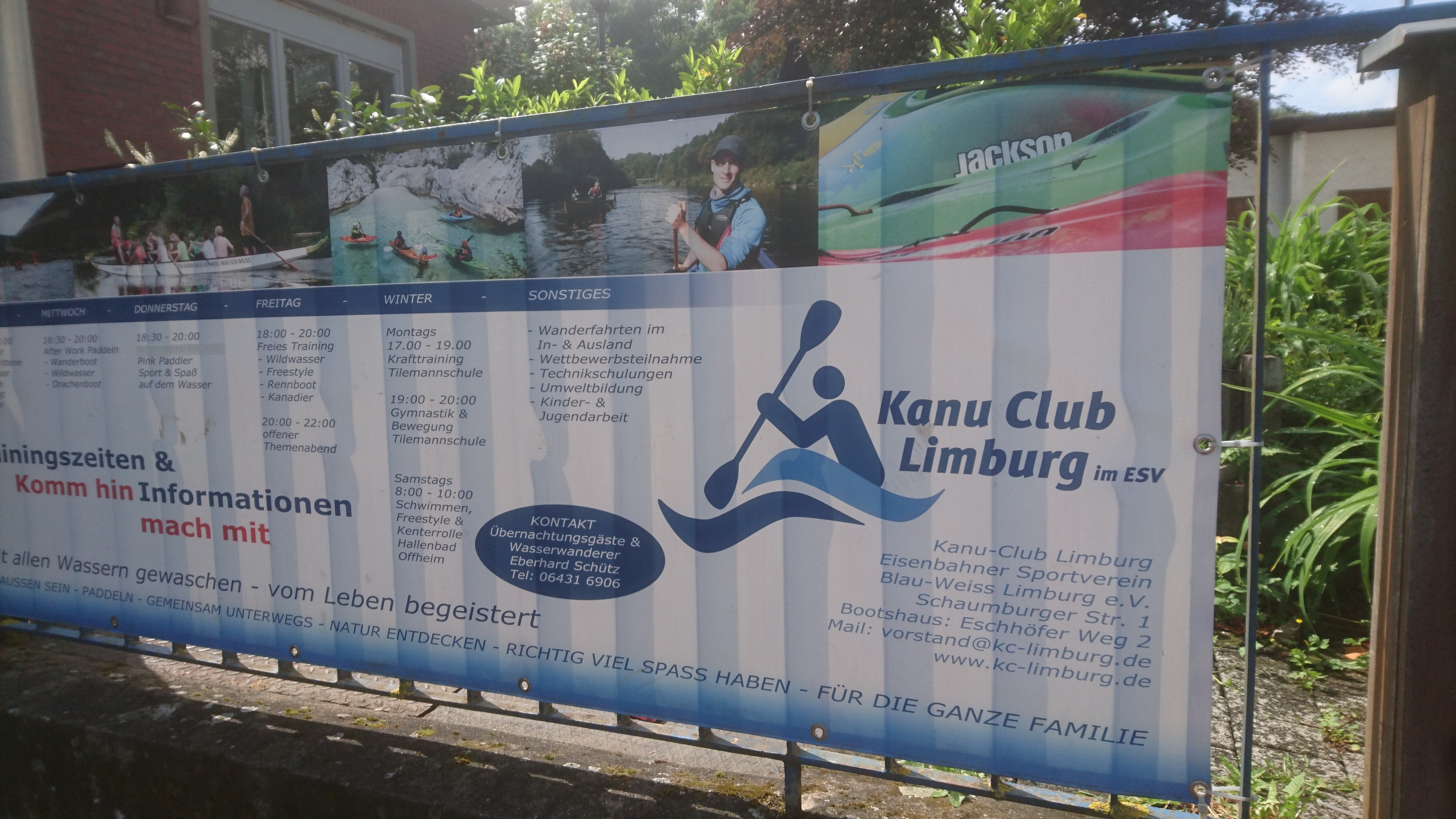
64.6 km – Limburg. Cathedral left. Camping right (click here). Alternatively keep left and by the no entry sign, left bank just above the weir, Limburg canoe club allow camping. Small site, best to ring ahead.

The camino which has been following the river on high ground to the south descends the hill in a zig zag and then goes straight up to the cathedral.
Keep right for lock channel. Left another set of two weirs in series. Followed by Limburg bridge


65 km – Limburg.
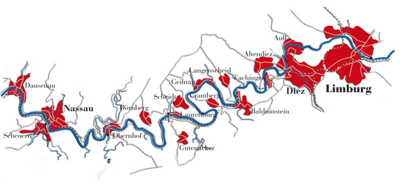
For Limburg to Lahnstein click here.
Waterbirth videos
Propaganda
At work I steer clear of birth underwater. I disapprove, but disapprove even more at obstetricians interfering in normal birth. If asked, I give advice in the normal way but, despite practising obstetrics for almost 40 years, I’ve never witnessed one in real life.
Some enthusiasts think that if people like me did, we might be converted. Recently on Twitter, Milli Hill, a journalist hoping just that, invited a few male obstetricians to watch this waterbirth video (click here).
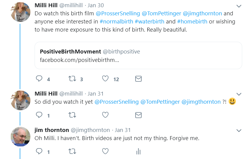


My reply that “birth videos aren’t my thing”, was a clumsy attempt to forestall an argument, but it and a couple of other similarly lukewarm responses seemed to have the opposite effect.
Discussion about water and home birth got conflated, obstetricians were accused of defensiveness, the patriarchy came up, someone shared an emotional blog about a stillbirth at home, and someone else talked of throwing a grenade into the birth debate.

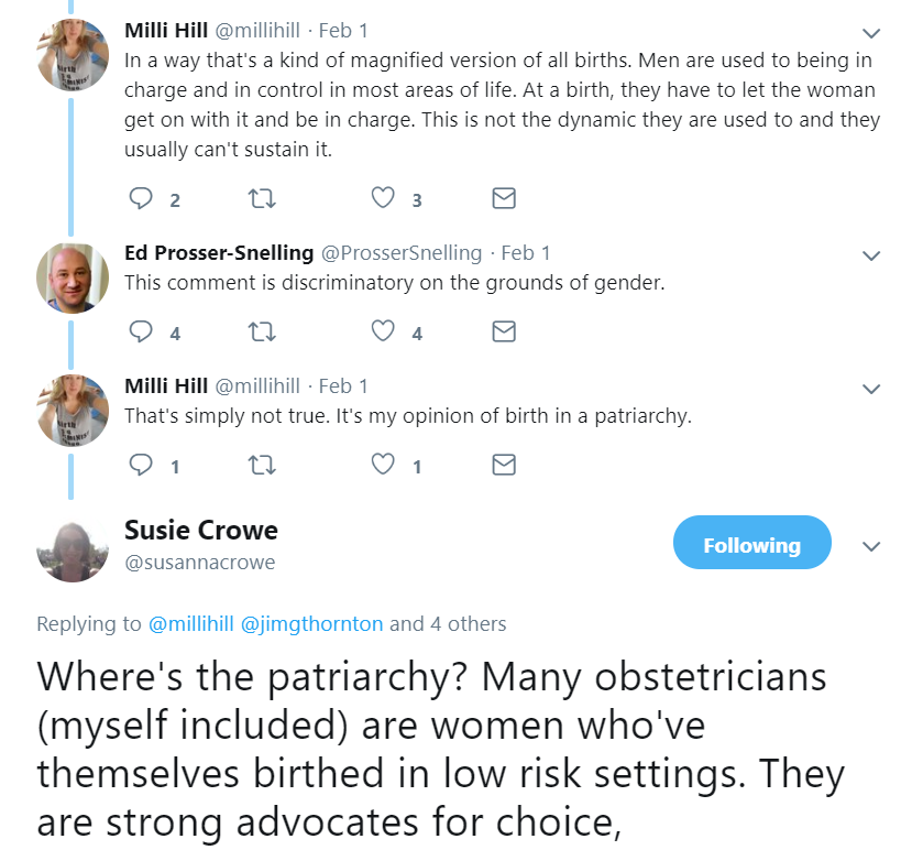

Poor Milli was both disturbed at our original refusal to emote, and shocked at the reaction to our refusal. I lay low.
But the central issues seemed to be lost in the debate, so as the dust settles, let me try and explain.
Why birth videos in general are “not my thing”
I’ve no issues with home birth, but still don’t watch dry land home birth videos. Hospital dramas and documentaries leave me cold. It’s not a control thing. It’s not the patriarchy. I rejoice when any woman gives birth safely without help. But caring for birthing women is my job. And for every birth attendant that means worry. We’re paid to appear calm and professional on the surface, but we’re also paid to check, anticipate and plan for trouble. I’d go so far as to say that if birth attendants don’t find their job a bit stressful they’re doing it wrong.
I don’t just mean clinical worries about things like cord prolapse and abruption. Of course we worry about those things. But we should, and usually do, worry about everything else as well. A good home midwife, calming the partner of a woman in transition as dawn comes up after a long labour, also remembers that the rush hour traffic will make transfer slower if needed. A good obstetrician, encouraging a woman to persevere with an attempt at a vaginal birth after Caesarean, also remembers the twins next door, and that the night registrar has called in sick and the locum is new. Others may view birth videos with pleasure but to me they’re a busman’s holiday.
But why couldn’t I have faked it for Milli? Said: “How lovely!” and moved on. That’s because it was birth underwater.
Why waterbirth videos in particular
I have a visceral dislike of birth underwater. It’s a risky, almost evidence-free experiment with no underlying rationale (click here). Perhaps I’m over-reacting, but it’s one of the few things that makes me crosser than Brexit!
And the video is propaganda. Not just the editing, soft music and beautiful photography, although there’s plenty of that. But the implication that a difficult first birth has been converted to a beautiful second one by being at home, in the pool, with family, friends and first child in attendance.
We aren’t told much about the first birth but it seems reasonable to assume that it had ended via the vaginal route. Second births in such cases are almost invariably easy. Yes the midwives were wonderful, home was a perfectly reasonable place to have the baby, and it was correct to not interfere, but the baby would have come just as easily on dry land, with no risk of water aspiration, intoxication or water-related infection.
I’m sorry Milli
If I’d been quicker witted, I’d have watched the video and made an intelligent comment on the calm, efficient and discreet way the midwives went about their safety-critical duties – monitoring the water temperature, auscultating the fetal heart, checking for bleeding while the mother bonded, and that the clamp was correctly placed before the father cut the cord. See, I did watch it! All that impressed me a lot. I am delighted that such skilful midwives looked after her.
But I have to be honest. I didn’t enjoy it. I don’t think birth underwater is wise. And this sort of video isn’t going to convert me.
Jim Thornton
My C-Stich prediction
No net effect

The C-Stich trial is testing the hypothesis that, among women with cervical insufficiency, monofilament nylon cerclage sutures reduce pregnancy loss compared with braided tapes (click here). I’m not closely involved and rarely perform cerclage, but Nottingham is a recruiting centre, so I do what I can.
I confess to being rather lukewarm. Surely the bigger methodological issue is “buried v not buried”, and the more fundamental question whether, and in what situations, cerclage does more good than harm. But to their credit the C-Stich investigators are planning to tackle the latter in their next trial C-Stich2.
Meanwhile my not very exciting prediction is here. Although I doubt there will be a difference between the materials, I would not be unduly surprised to be wrong. There may be less infection around the monofilament, but sutures can also come undone, which may be more likely with monofilament. The result could go either way. I guess that why they’re doing the trial.
The trial is recruiting nicely. The original sample size of 900 participants was increased to 2050 last year because the pooled event rate was turning out lower than expected. That is good research practice. It will at least allow the best suture to be used in C-Stich2, so that if that trial is negative, enthusiasts wont be able to later claim it was because “they used the wrong suture”.
But if one material turns out better than the other, that would emphatically NOT be evidence that cerclage is better than nothing. It’s just as likely that the other is less harmful.
Jim Thornton
For more on AsPredicted.org click here.
My PRISM prediction
My first public trial result prediction on AsPredicted.org
PRISM is a randomised trial comparing progesterone or placebo for the treatment of women with a threatened miscarriage. i.e. vaginal bleeding but the scan shows a heart beat, so the fetus is alive. Details here.
In July 2018, the chief investigator Arri Coomarasamy rang up to tell me the result in confidence.
It was a Sunday morning, I was eating my breakfast and tapping out a blog post criticising the way an education trial had been interpreted (click here). The post sank without trace – one “like” and no comments – but Arri’s call fired me up.
As he swore me to secrecy, I said:
“Not another word Arri. I’m going to predict the result on a date-stamped website, send it to you and call you back. Then you may tell me.”
Click here to read my prediction. Dates are in US format; Month/Day/Year.
Or if you prefer, guess what the arch sceptic, who believes the only thing maintaining interest in progesterone is it’s name (click here), predicted?
The trial publication will appear soon. You can see if Jim was right.
Jim Thornton
For more on AsPredicted.org click here.
